Brand Essence
Roasi is a coffee brand that goes beyond the product itself. It is built around a simple idea: coffee as a natural, honest, and refined daily ritual.
The Challenge
Roasi is a coffee brand that goes beyond the product itself. It is built around a simple idea: coffee as a natural, honest, and refined daily ritual.
The Challenge
The challenge was to create a visual identity that reflects purity and quality without falling into the typical “organic” or overly rustic direction commonly seen in the coffee industry.
Instead, the brand adopts a more controlled and elevated approach.
Visual Direction
Visual Direction
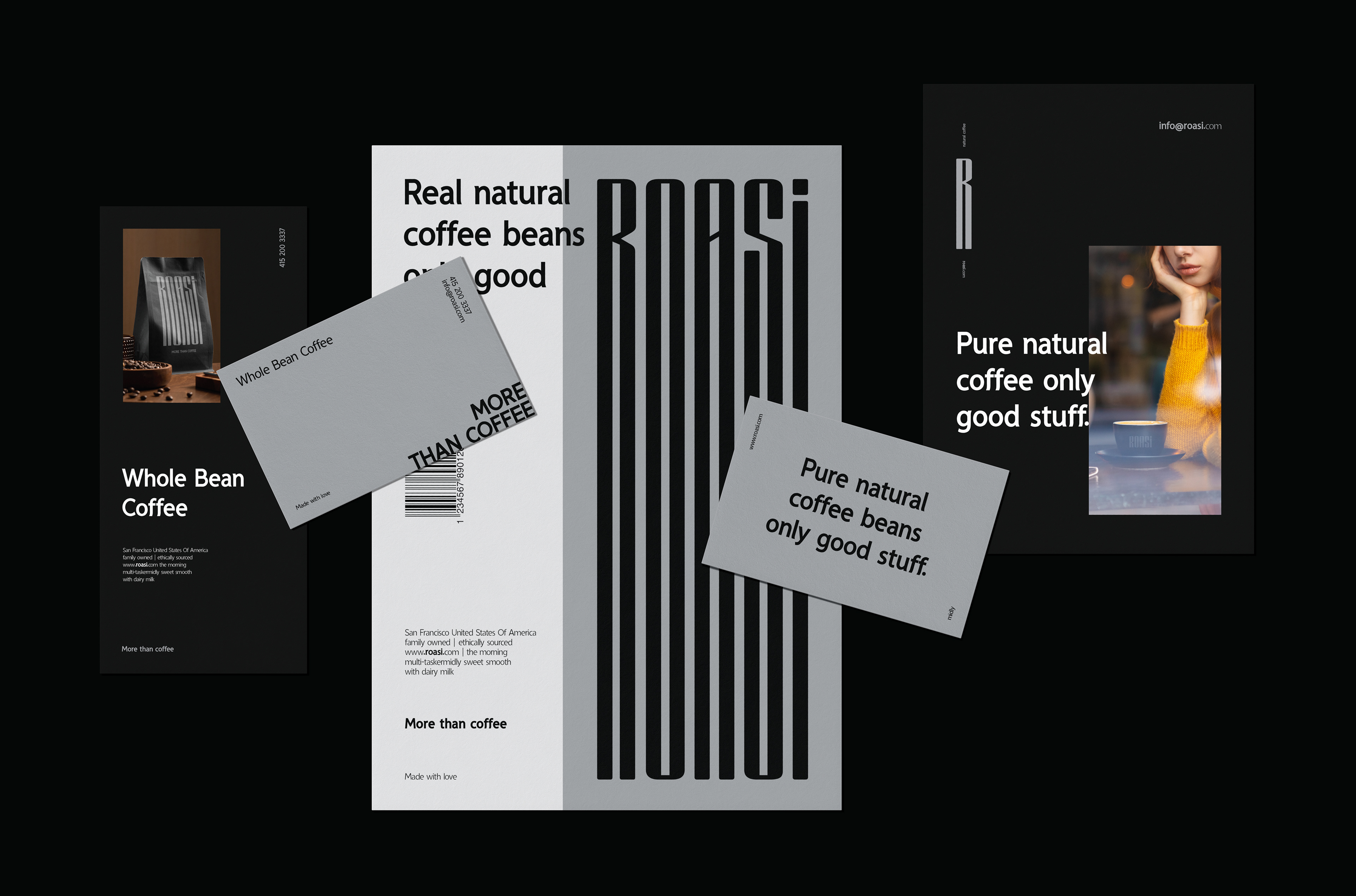
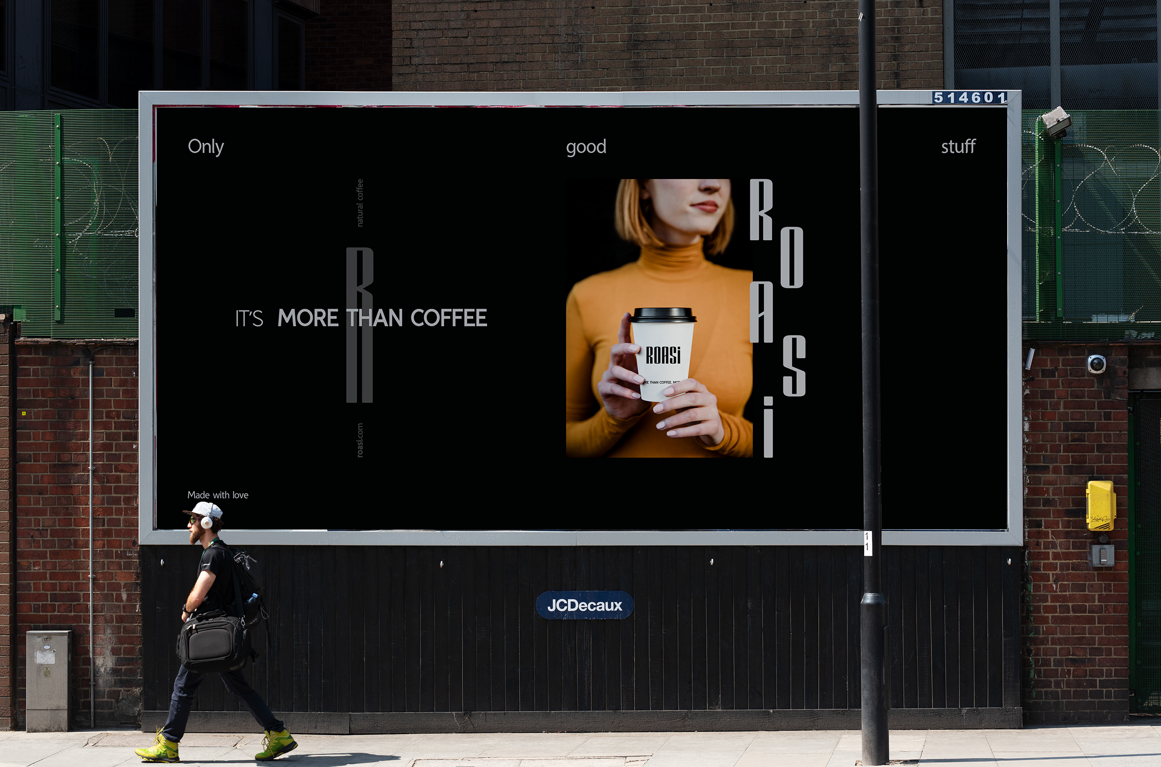
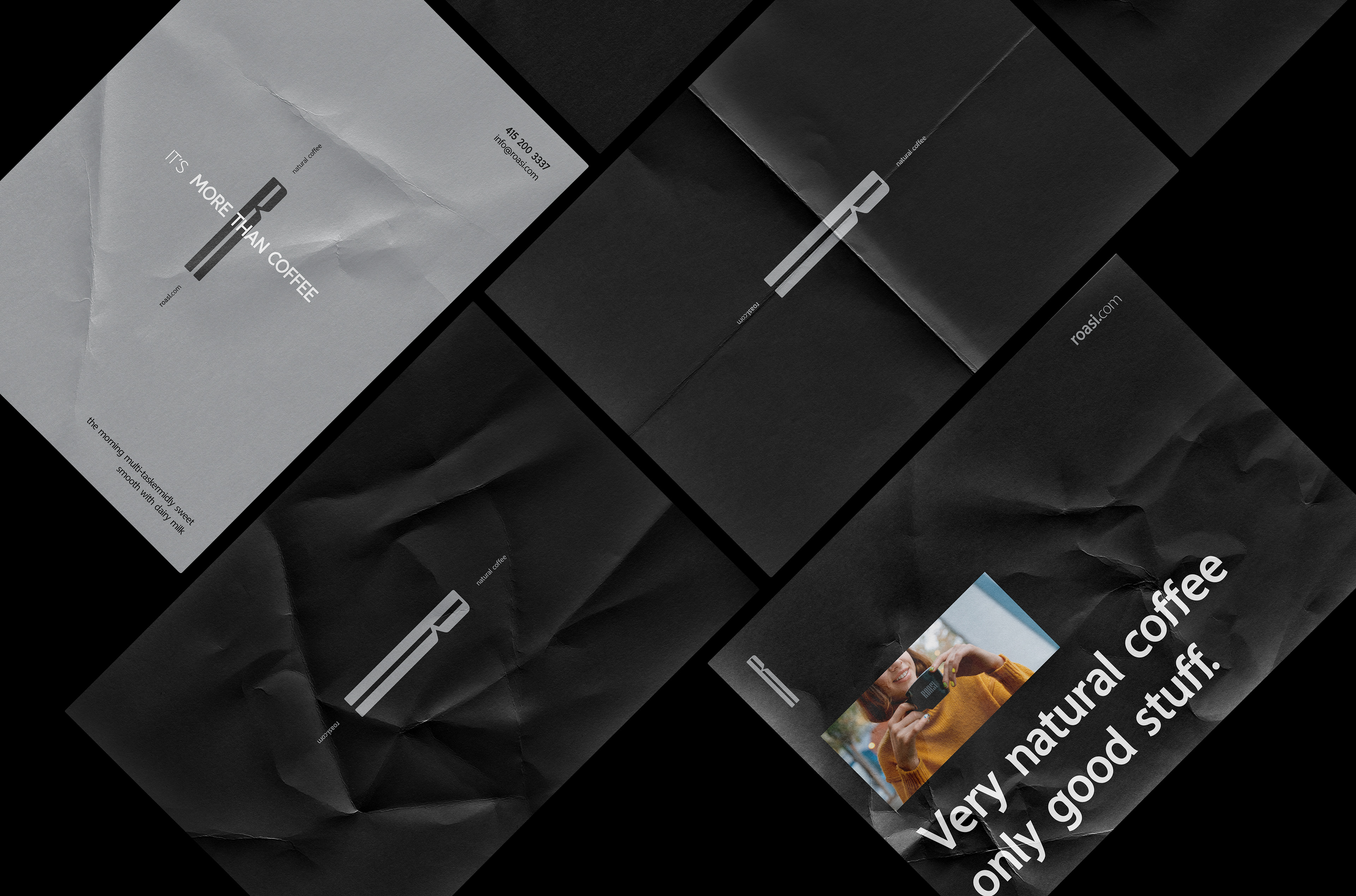
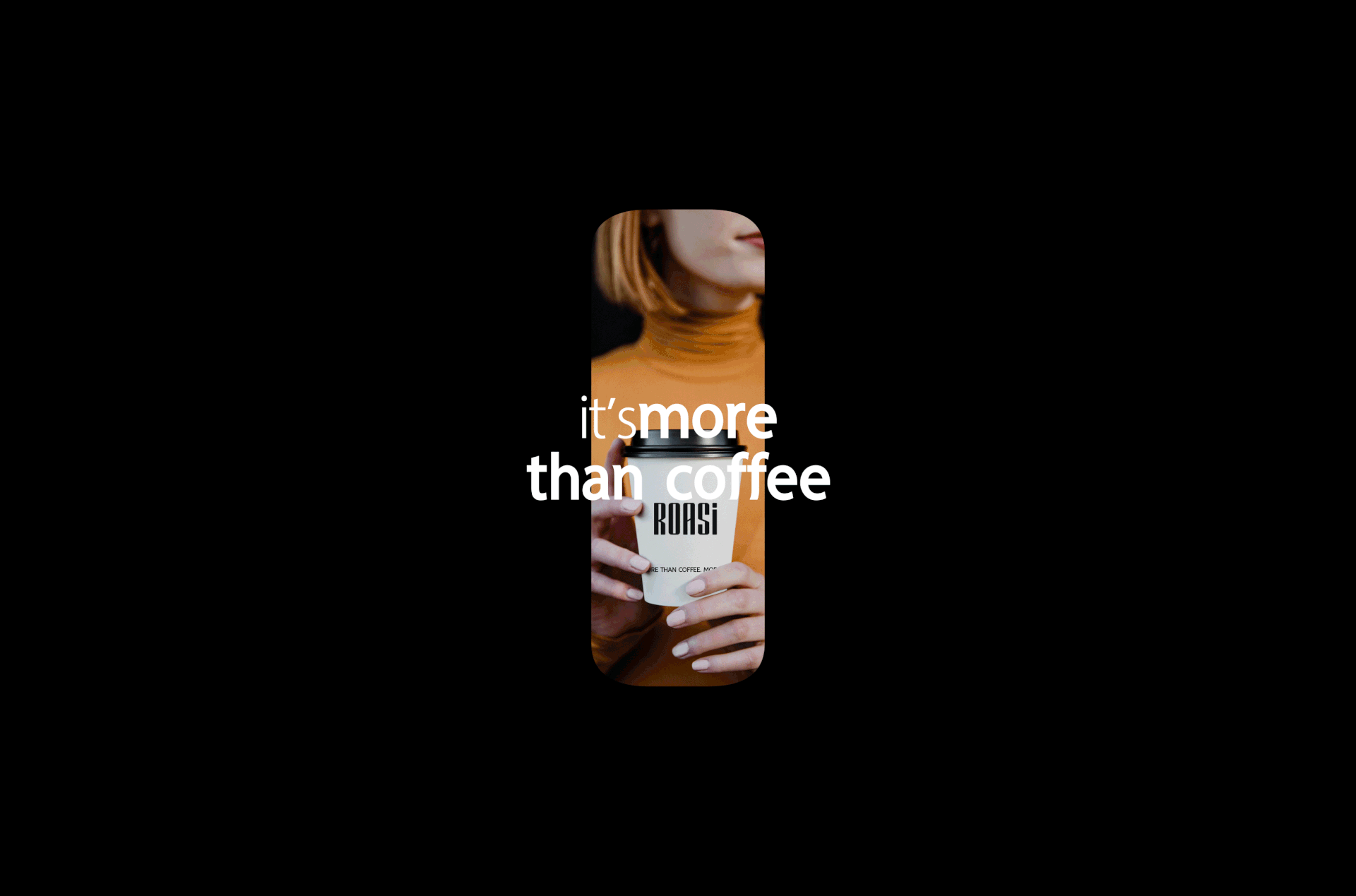
The visual language is inspired by the Art Deco direction, selected for its association with luxury and refinement, which define Roasi as a premium coffee brand. The identity focuses on its core principles of structure, balance, and timeless elegance, rather than its decorative expression.
Messaging & Tone
At the same time, the messaging emphasizes the natural essence of the product. Phrases like “Real natural coffee beans” and “It’s more than coffee” position Roasi as an experience rather than just a beverage, something honest, crafted, and meaningful.
Identity System
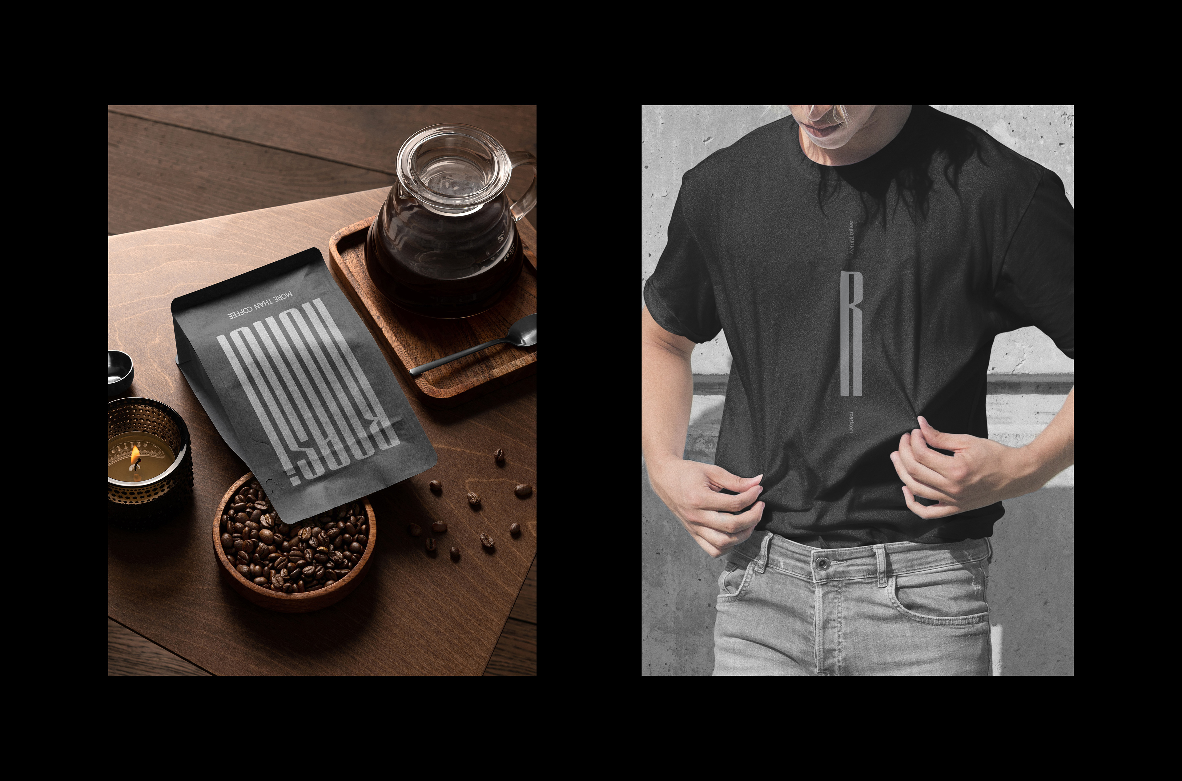
Identity System
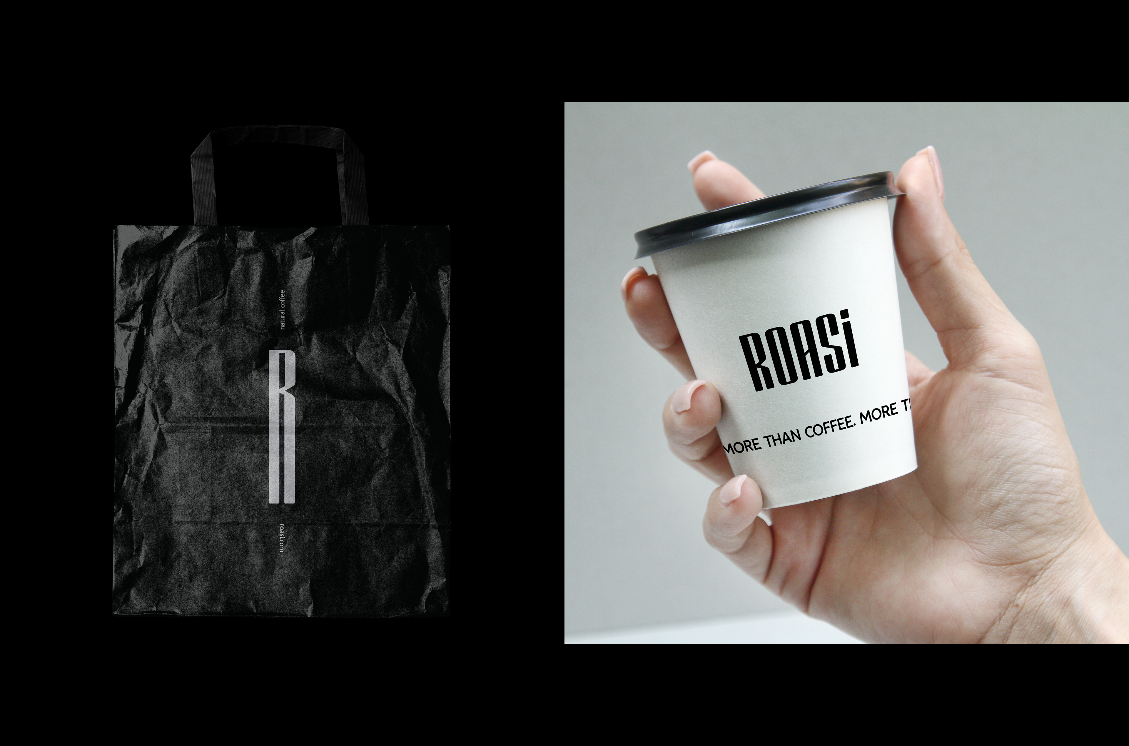
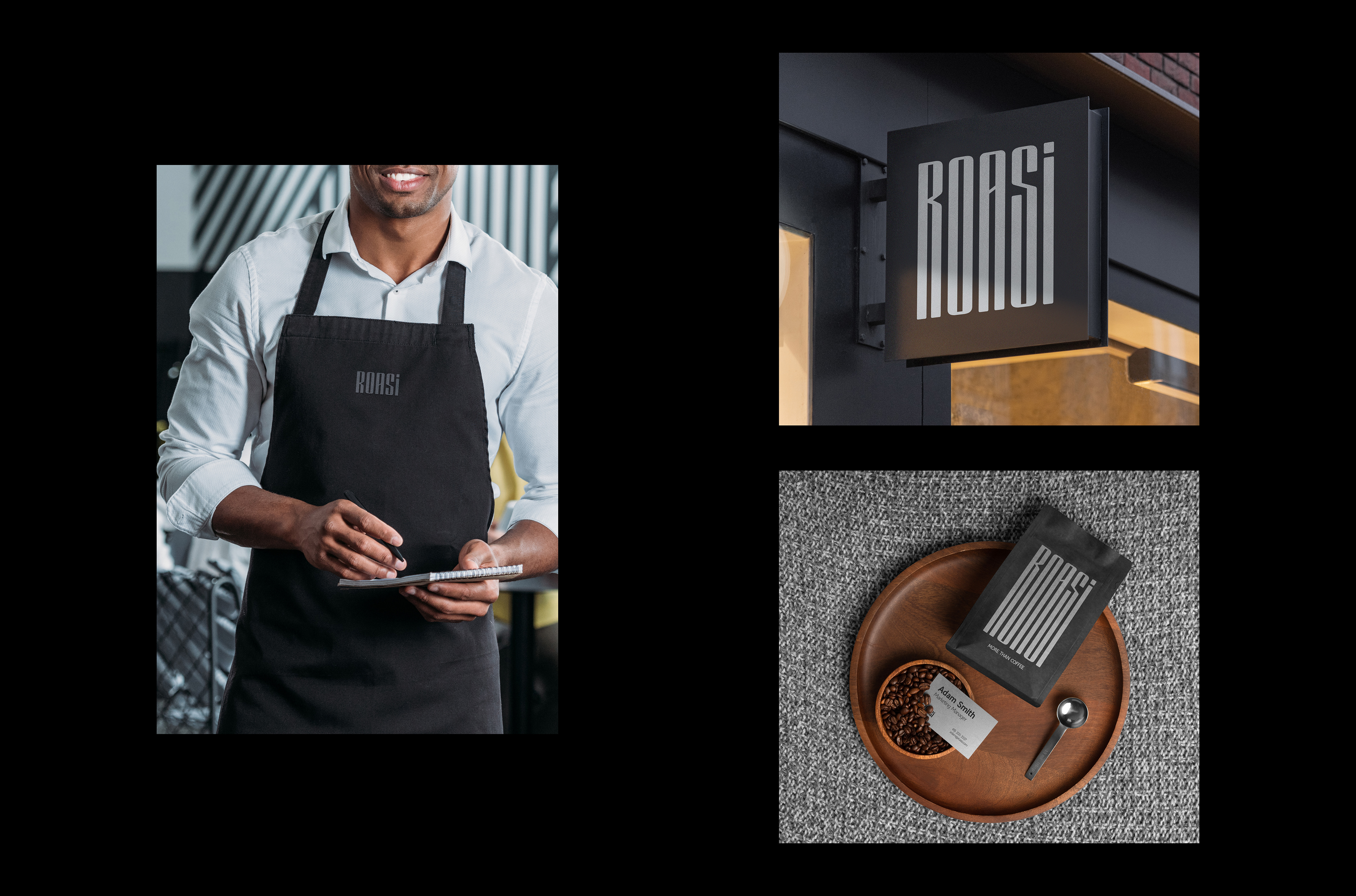
The identity system is built on minimal compositions, precise typography, and carefully considered spacing. Every element is reduced to its purest form, creating a visual presence that feels calm, premium, and intentional.
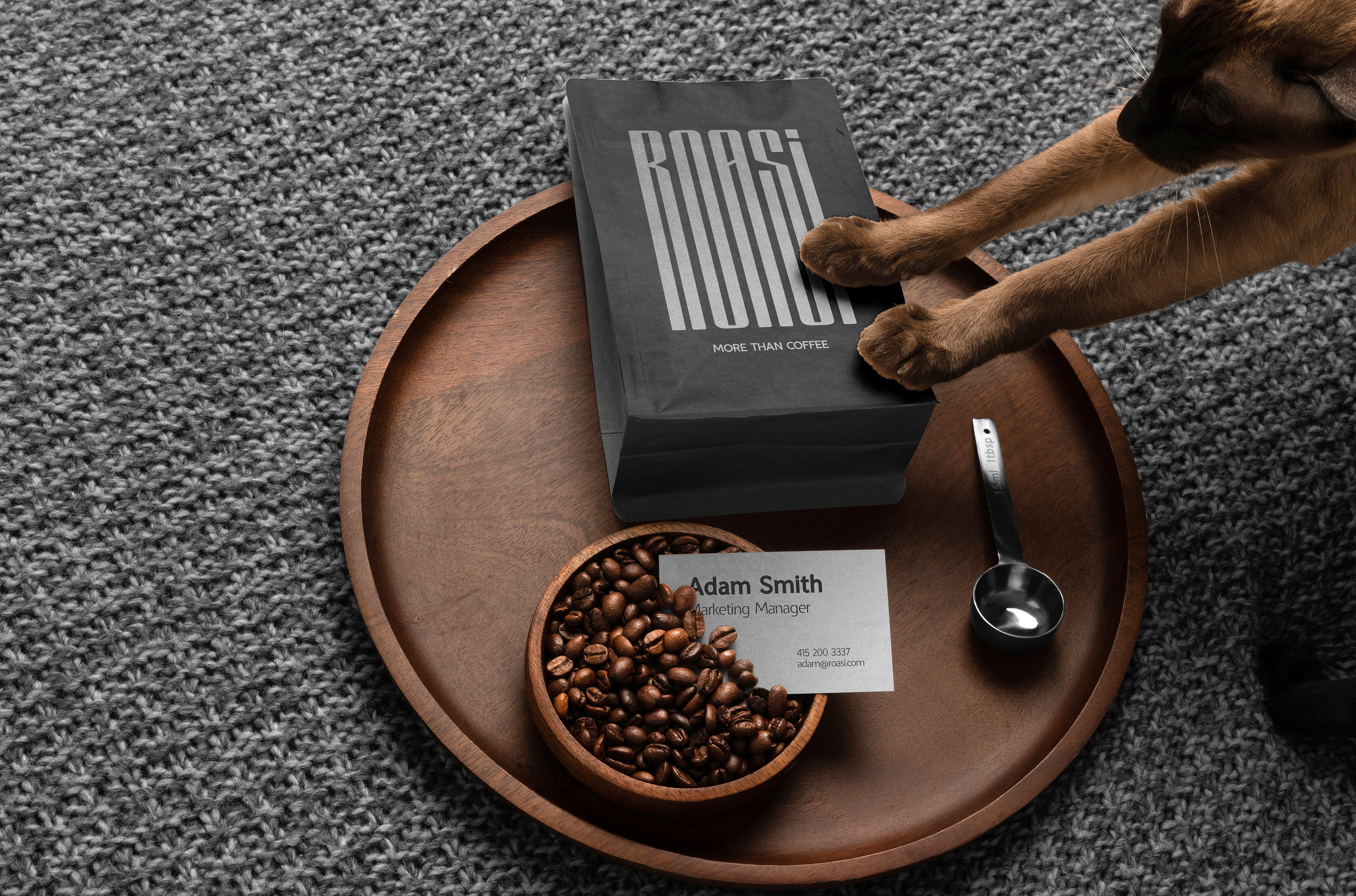
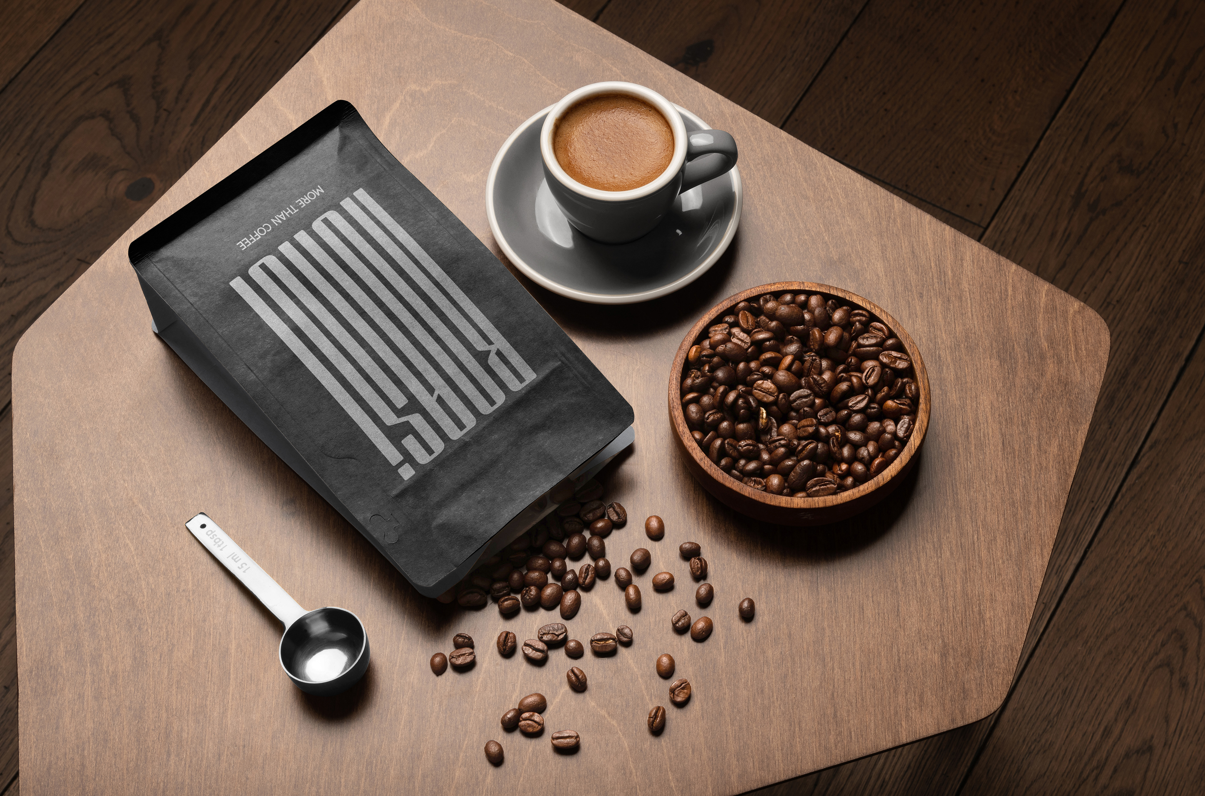
Packaging Design
Packaging Design
The packaging reflects this philosophy. It avoids visual noise and instead relies on simplicity and proportion to stand out, presenting the product with quiet confidence rather than loud differentiation.