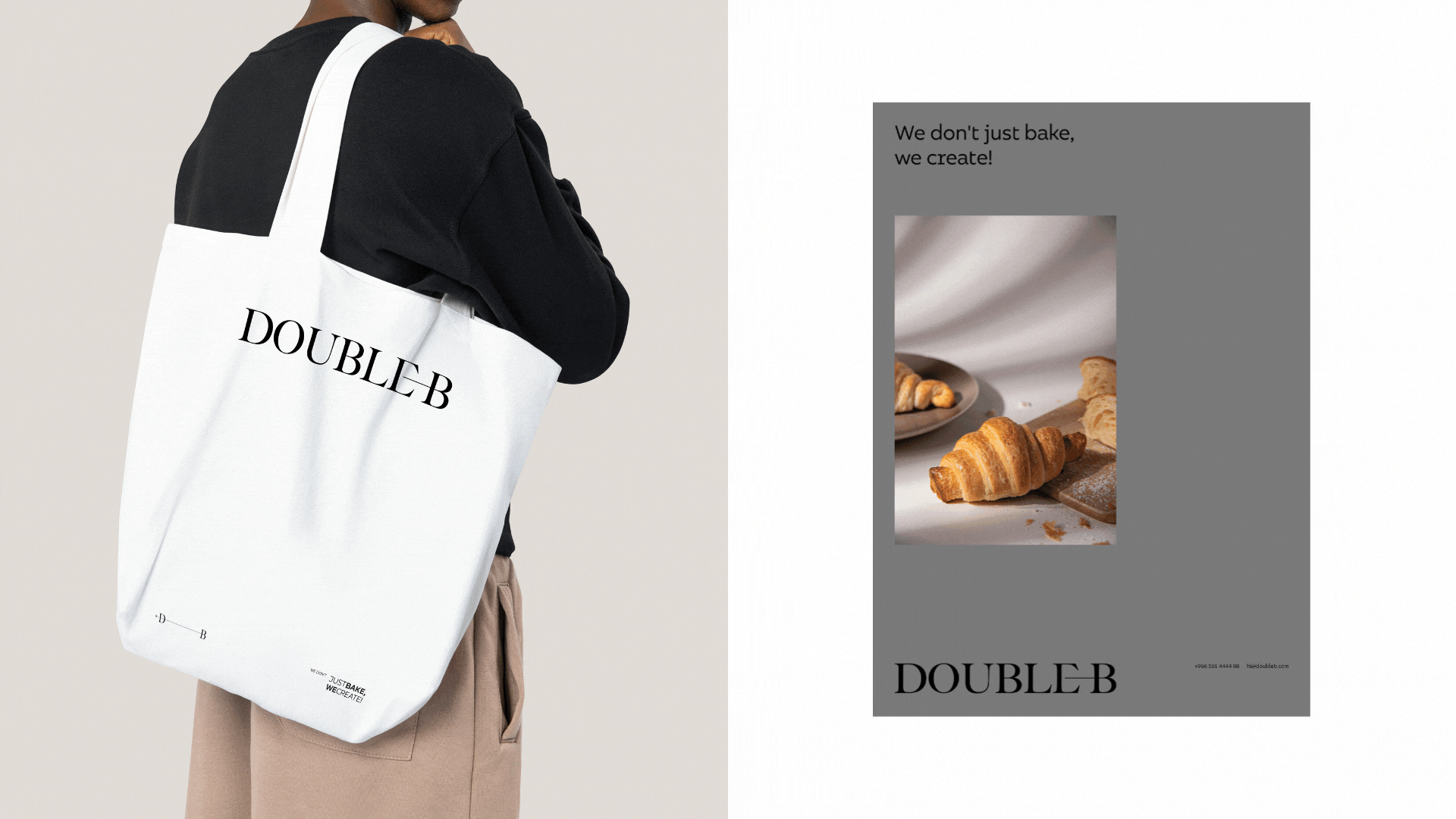
Double B – Brand Identity
Introduction
Double B is a bakery brand created for its founder, Bassem. The name carries a dual meaning:
- B for the founder’s name.
- B for Bakery, his craft.
The ambition was to design an identity that feels elegant, modern, and timeless, reflecting the sophistication of the brand while staying concept-driven and distinctive.
The Challenge
Most bakery brands rely on visual clichés — wheat, chef hats, or rustic illustrations. The challenge was to craft something unique and refined, a mark that avoids stereotypes and instead captures the true essence of baking in a minimal yet powerful way.
The Concept
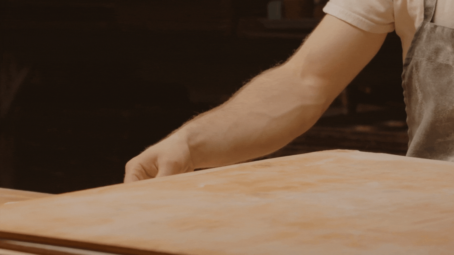
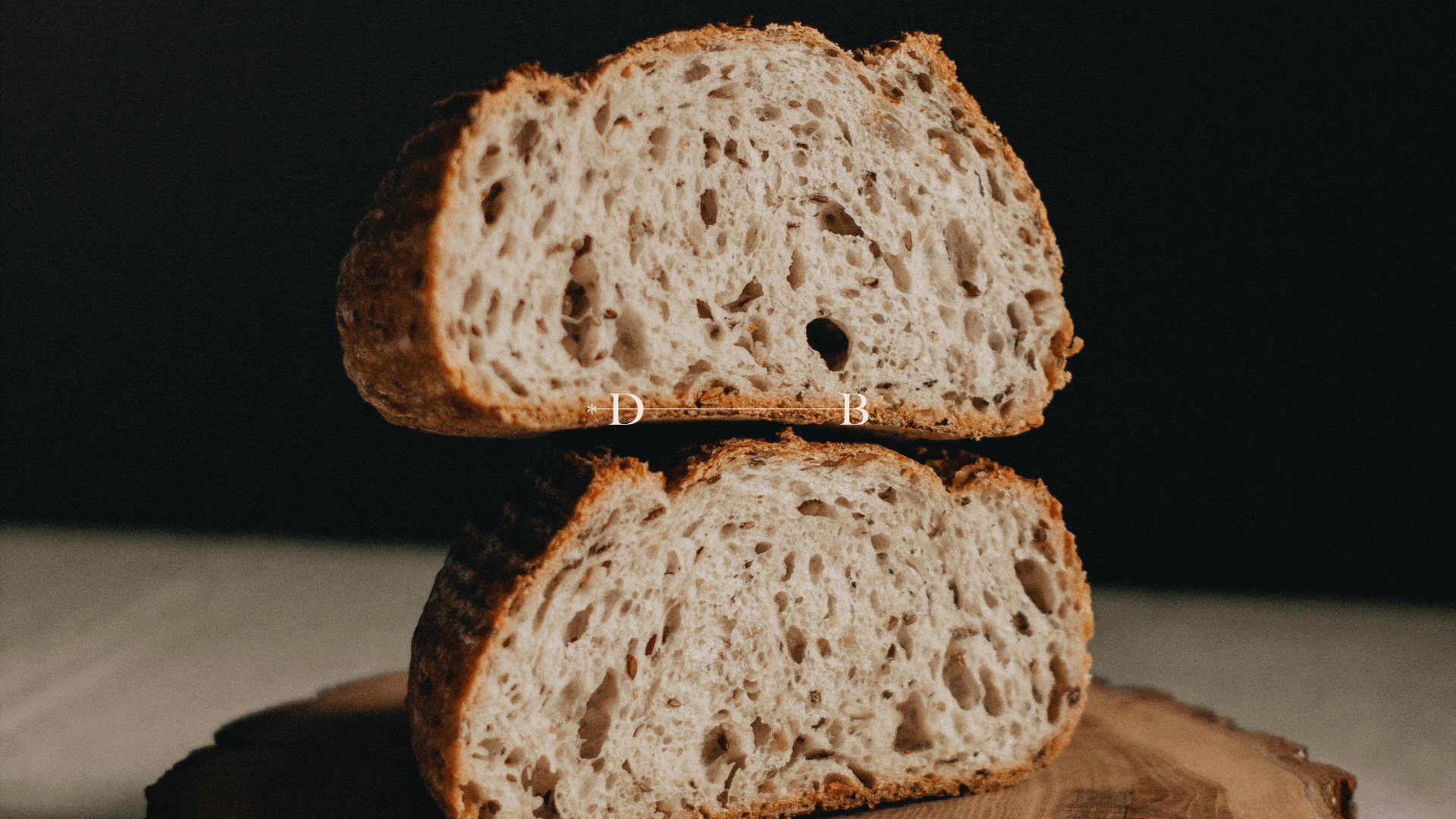
The inspiration came from the material at the heart of baking: dough.
Dough stretches, folds, and expands — a process that became the foundation of the design.
Dough stretches, folds, and expands — a process that became the foundation of the design.
This idea translated into an extended B, visually echoing the elasticity of dough while keeping the overall form clean, balanced, and sophisticated.
The name Double B turned into a visual metaphor, symbolizing both the founder and his craft in a way that feels elevated and modern.
The Process
The exploration focused on motion rather than traditional sketching.
By animating the letter B, I was able to reveal its flexibility and capture the exact movement of stretching and folding — directly inspired by dough.
By animating the letter B, I was able to reveal its flexibility and capture the exact movement of stretching and folding — directly inspired by dough.
This motion was not just decorative but became the core design principle, guiding the final shape of the logo and the identity.
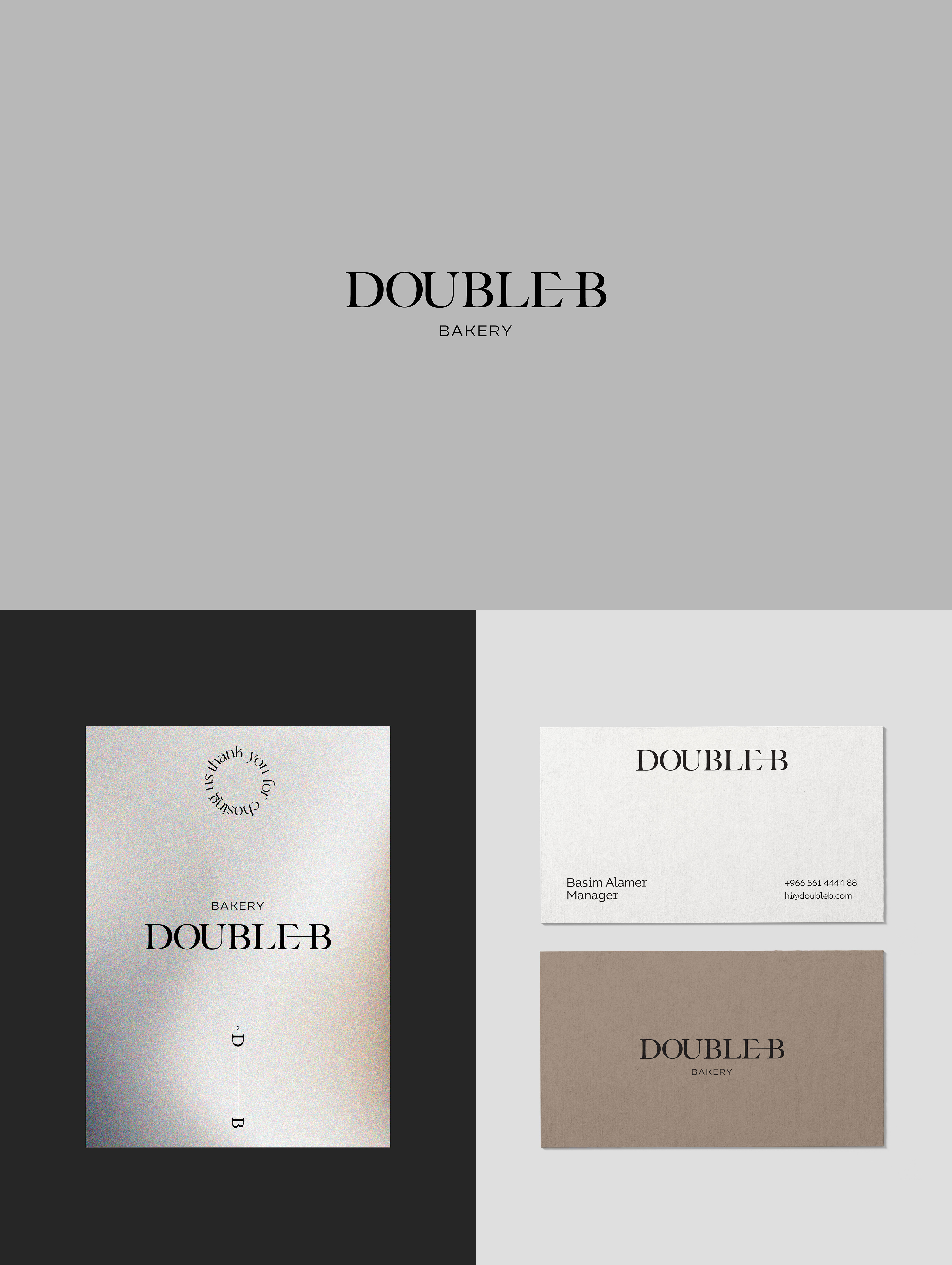
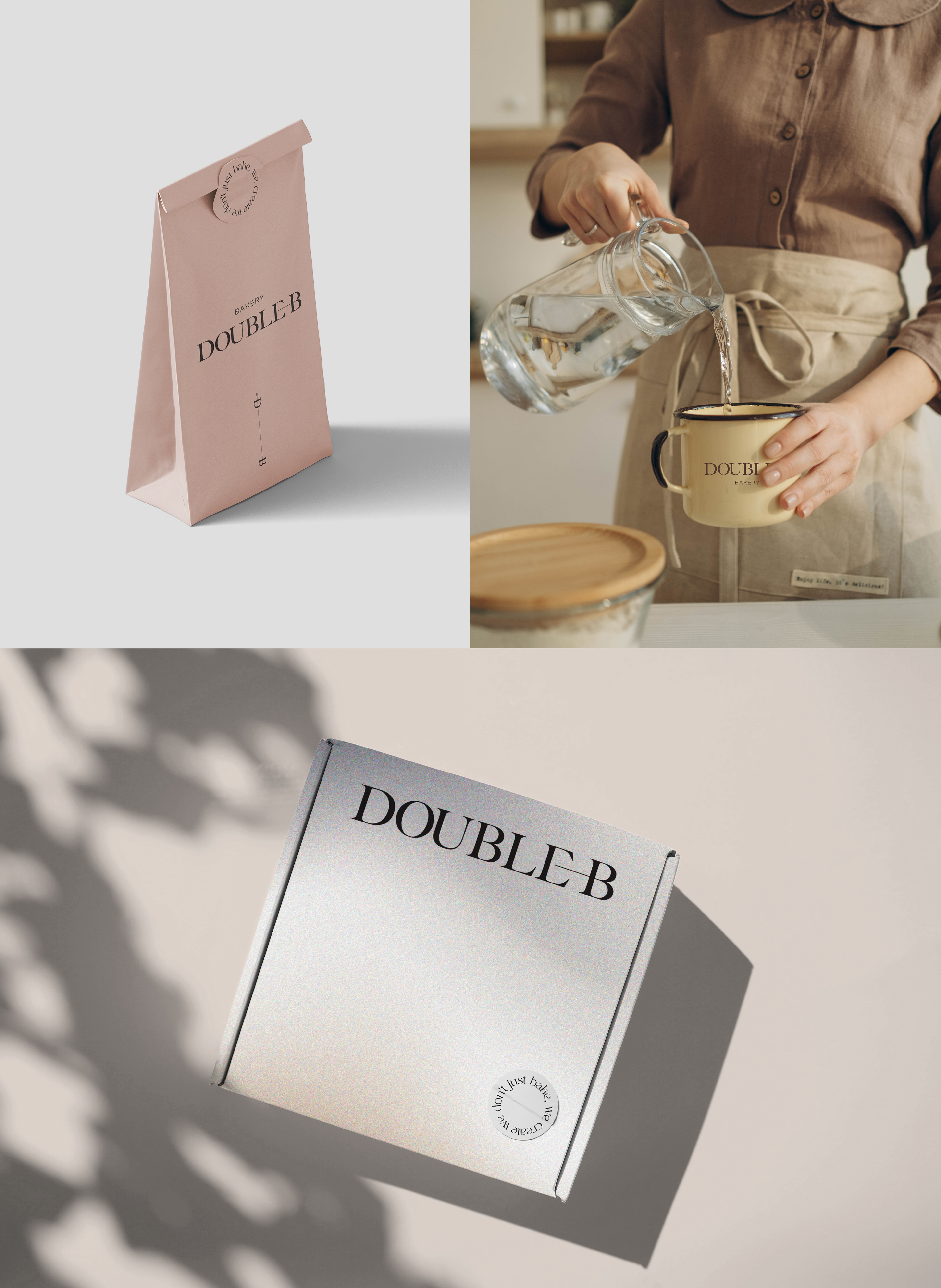
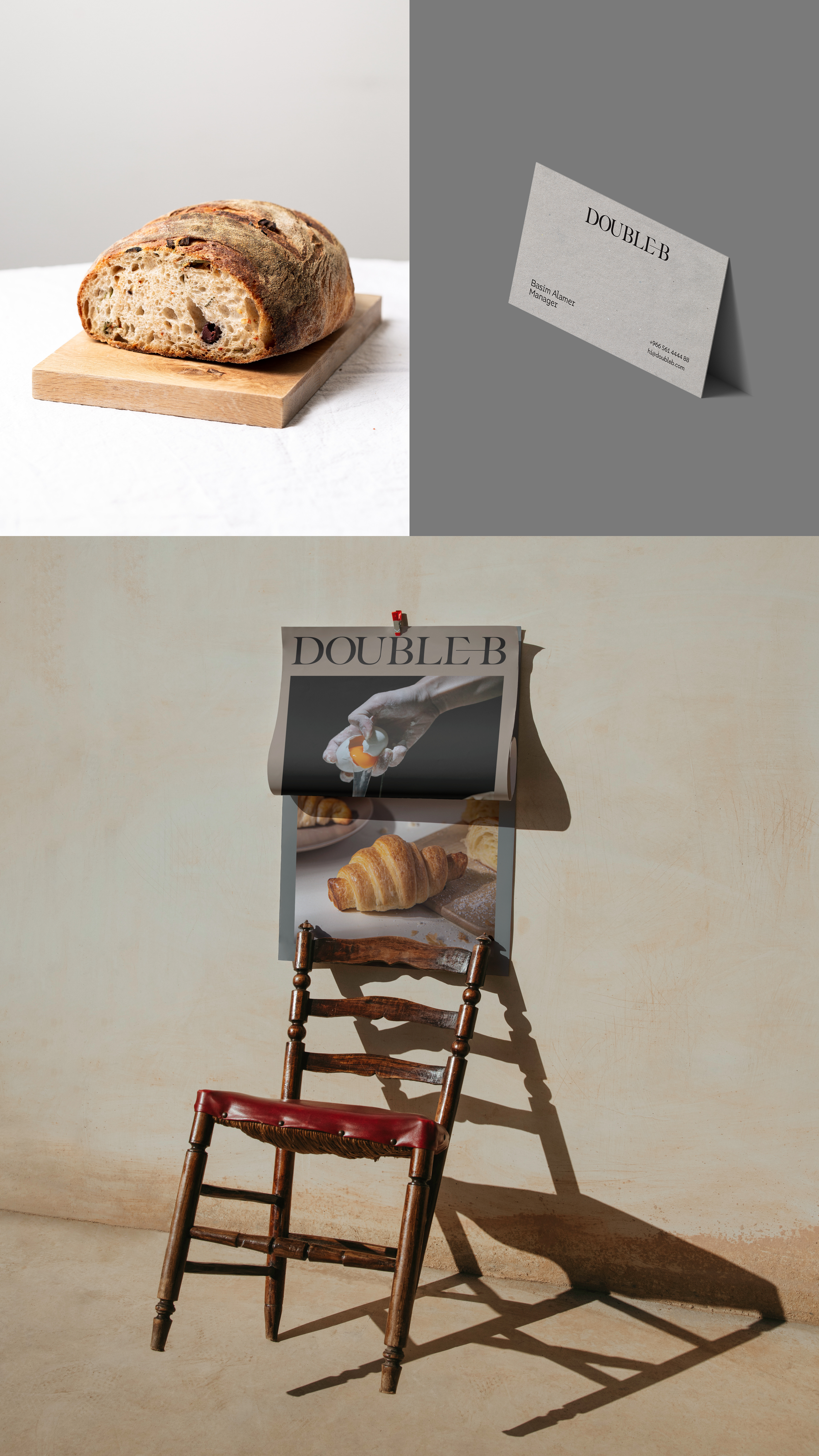
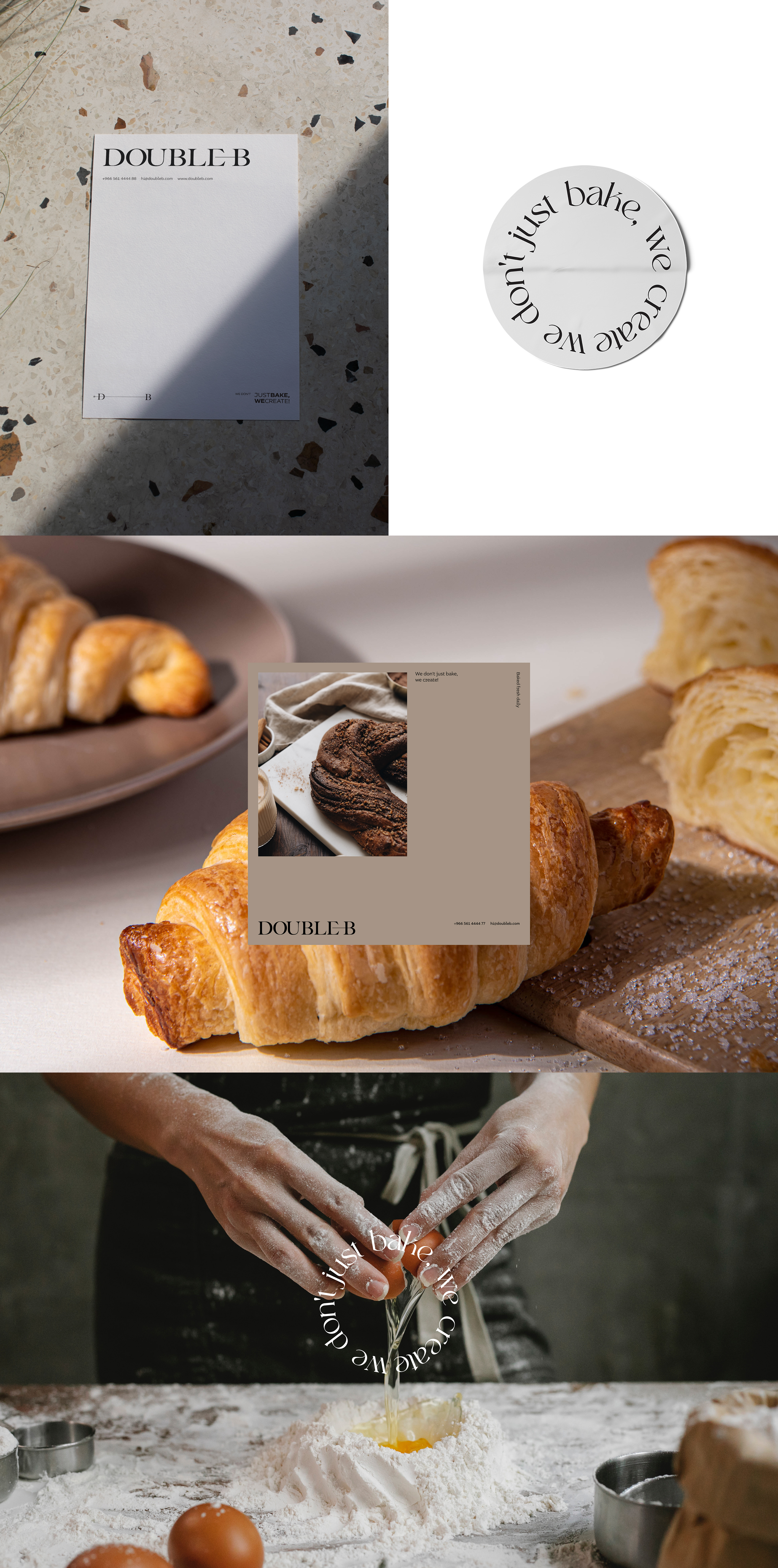
Deliverables
Logo / Brand System / Packaging / Art Direction