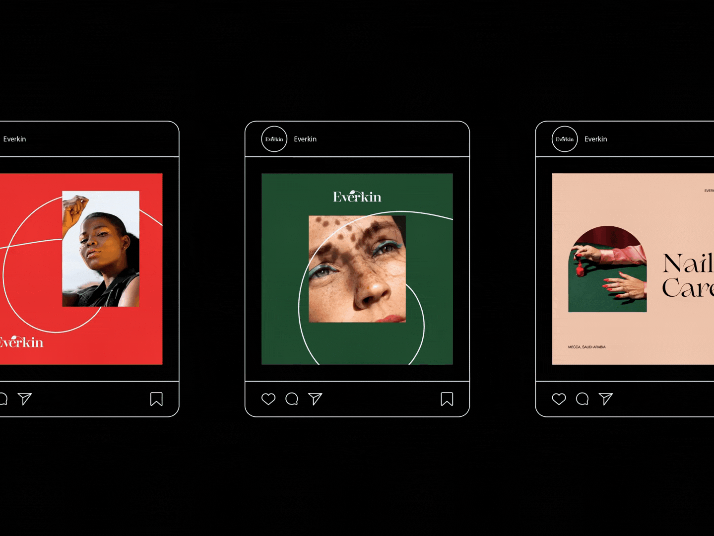
About the project
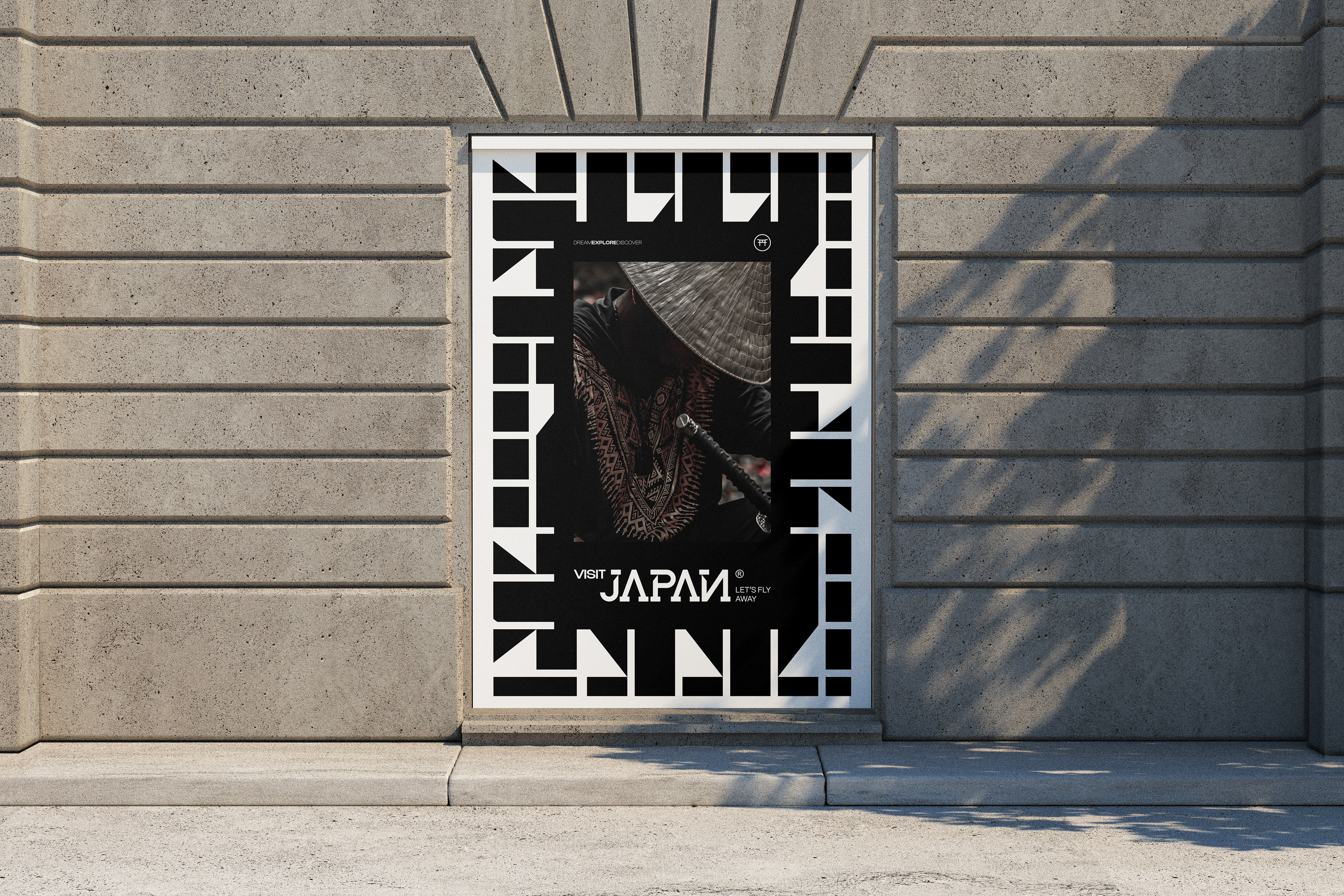
Visit Japan — A Bold Invitation to Explore Culture This project is a visual identity I created from the ground up for a travel brand dedicated to Japanese tourism. The mission was simple, yet ambitious: how can we distill the cultural richness, strength, and visual power of Japan into a brand that feels distinctive, modern, and deeply authentic?
The Challenge
In a space overwhelmed by cliché imagery and templated visuals, the main challenge was to create something unforgettable — a brand that feels like Japan without resorting to the obvious.
In a space overwhelmed by cliché imagery and templated visuals, the main challenge was to create something unforgettable — a brand that feels like Japan without resorting to the obvious.
The Concept
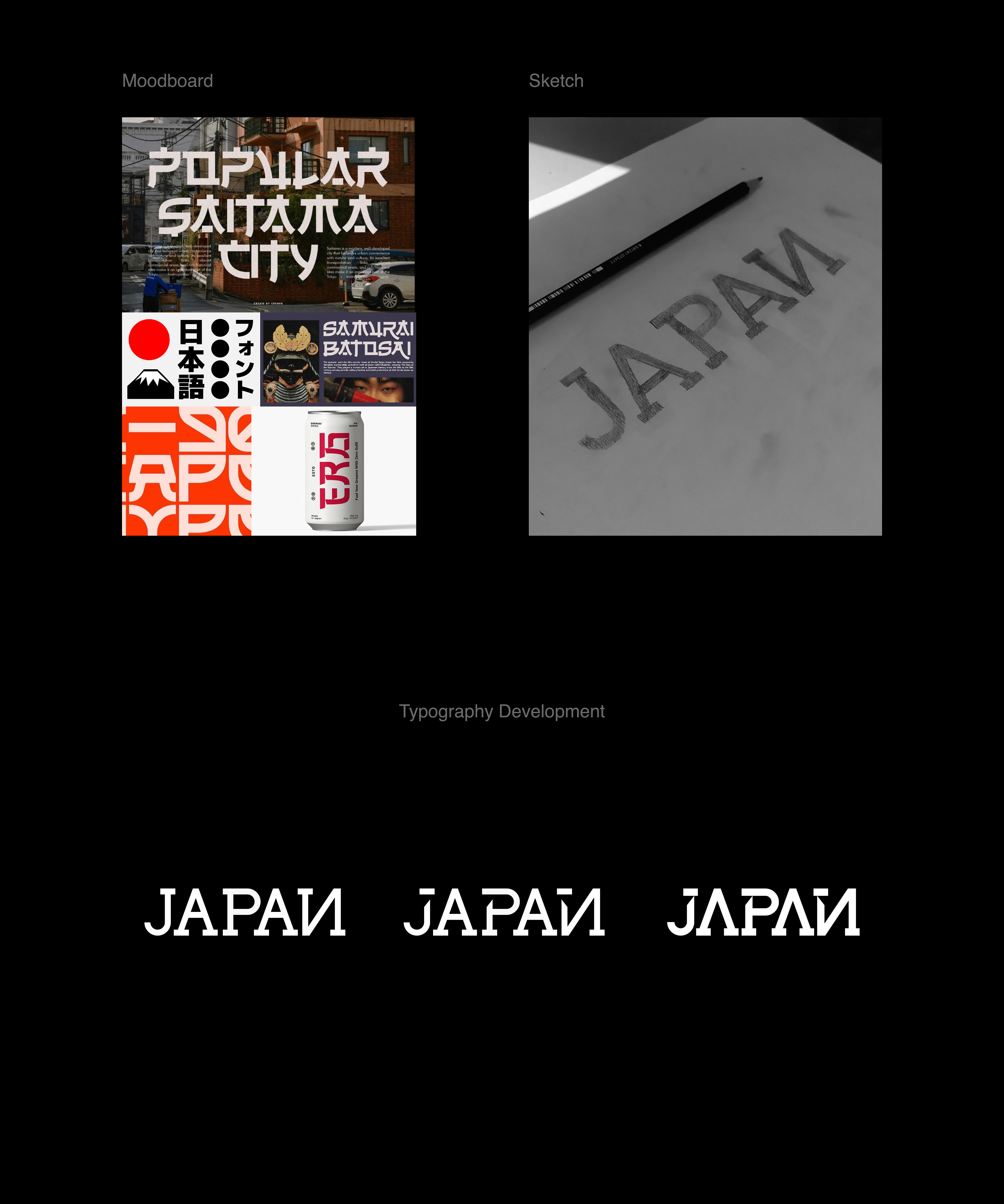
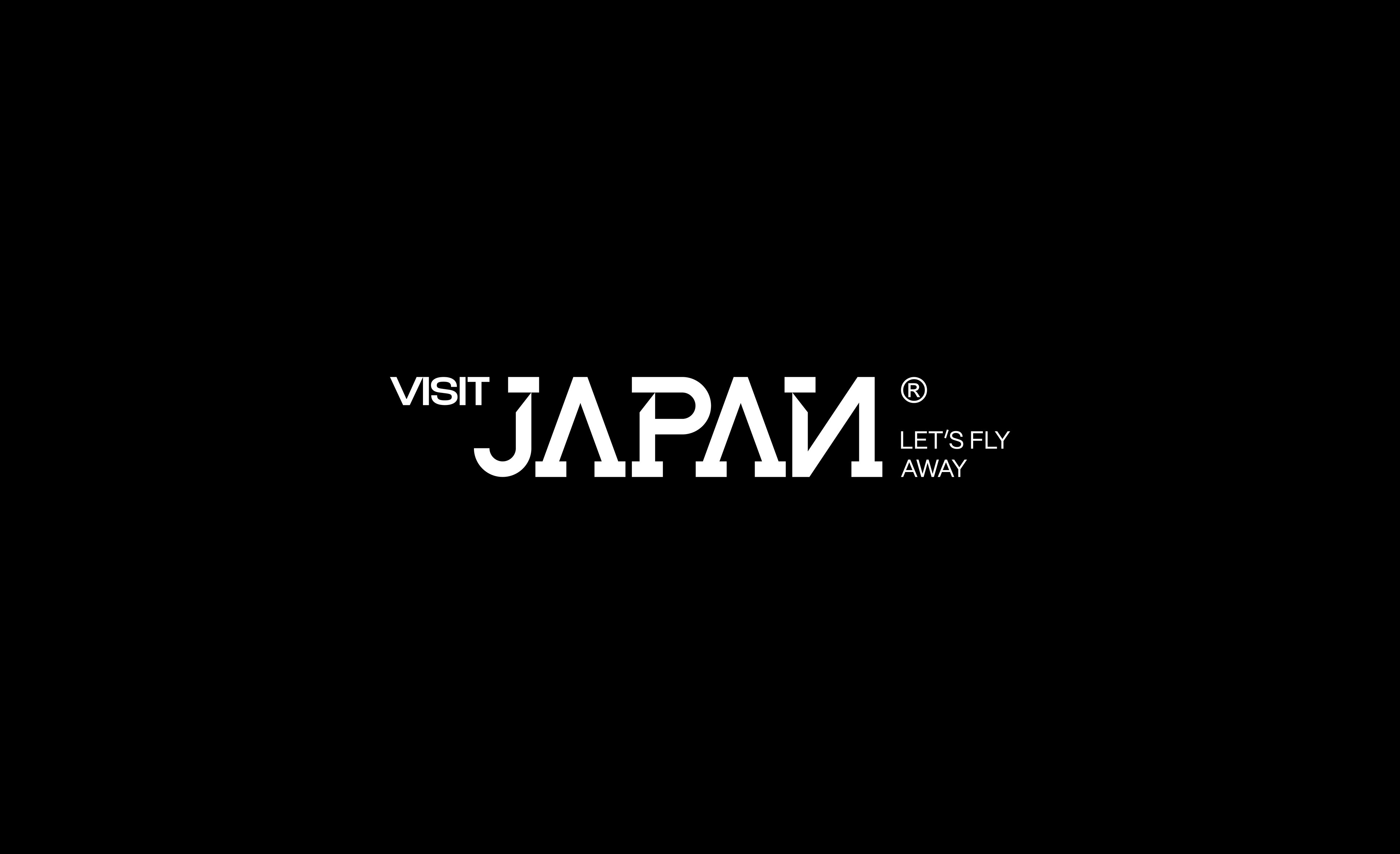
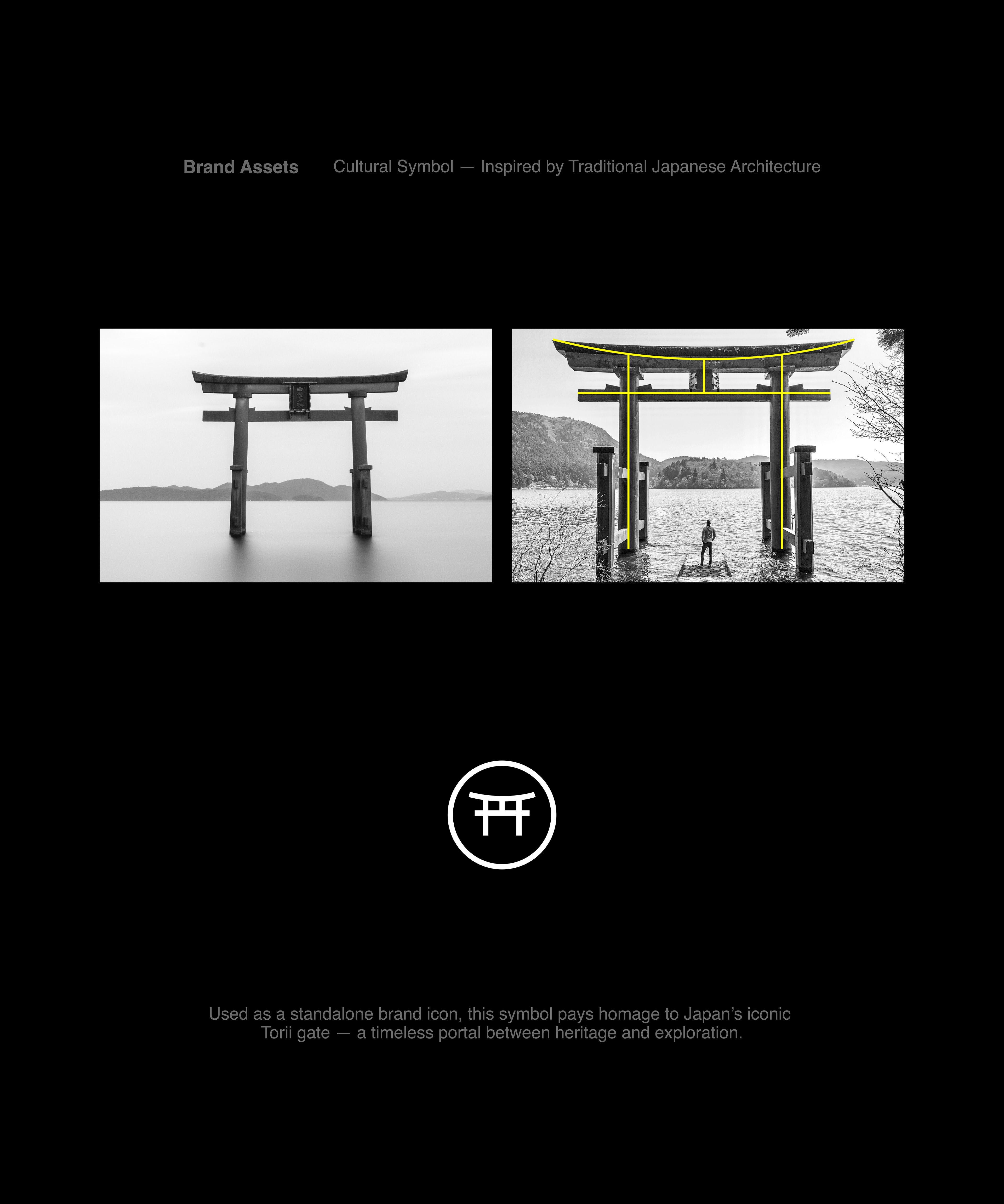
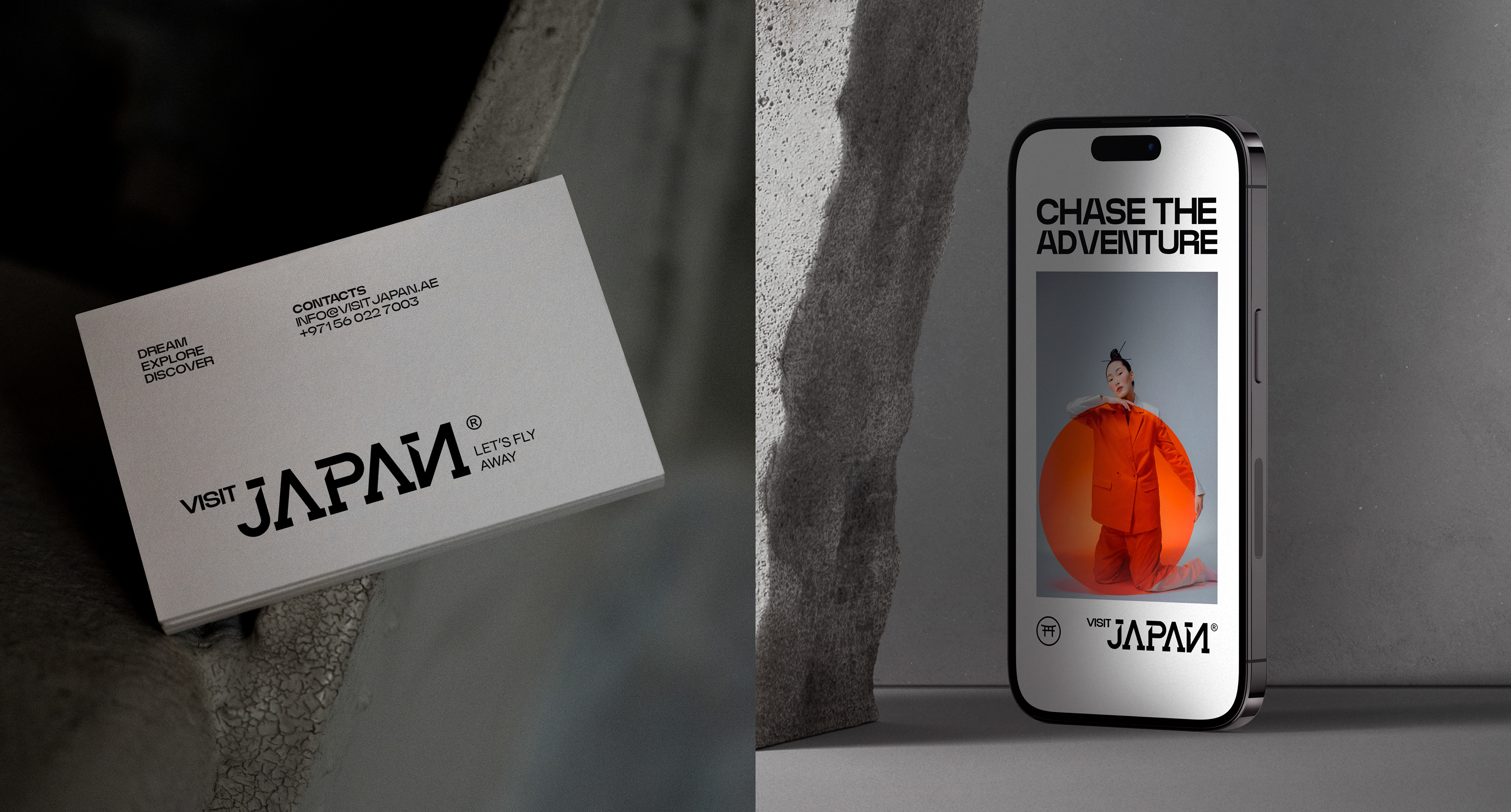
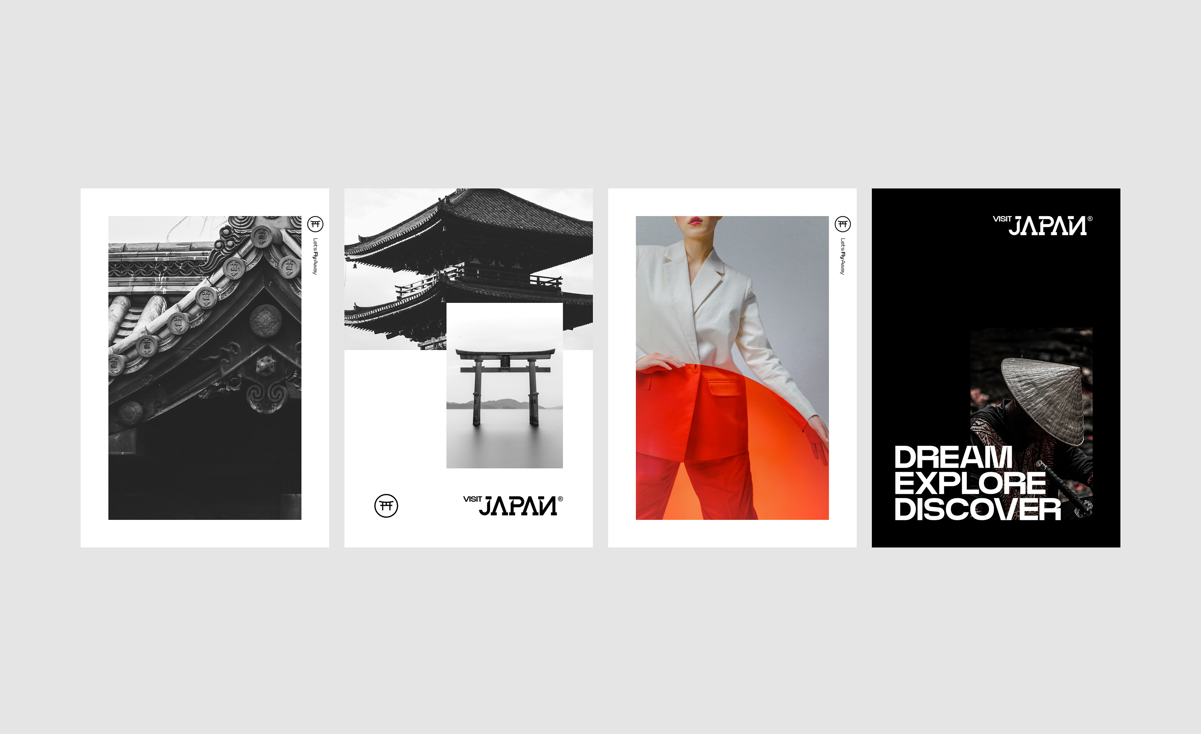
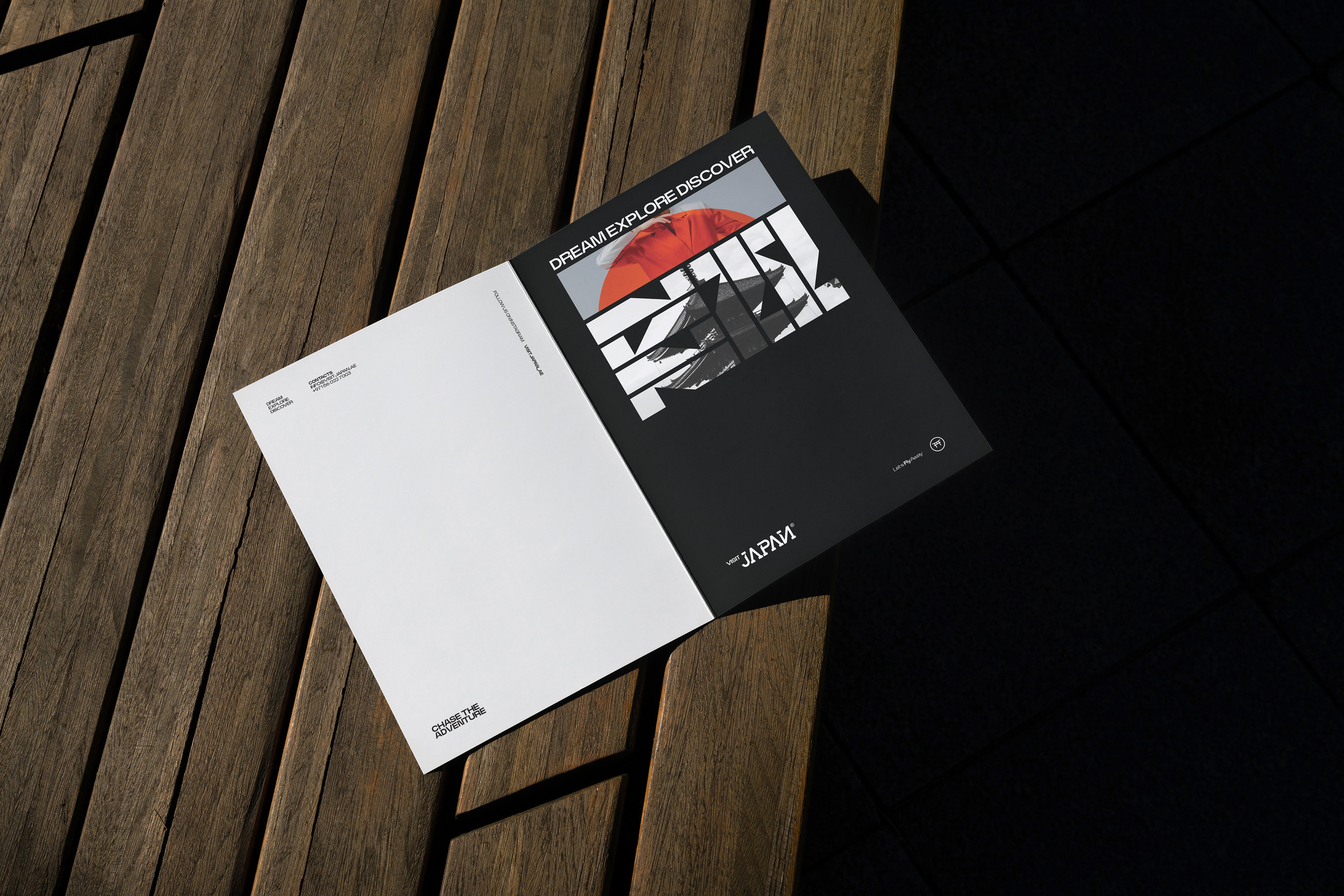
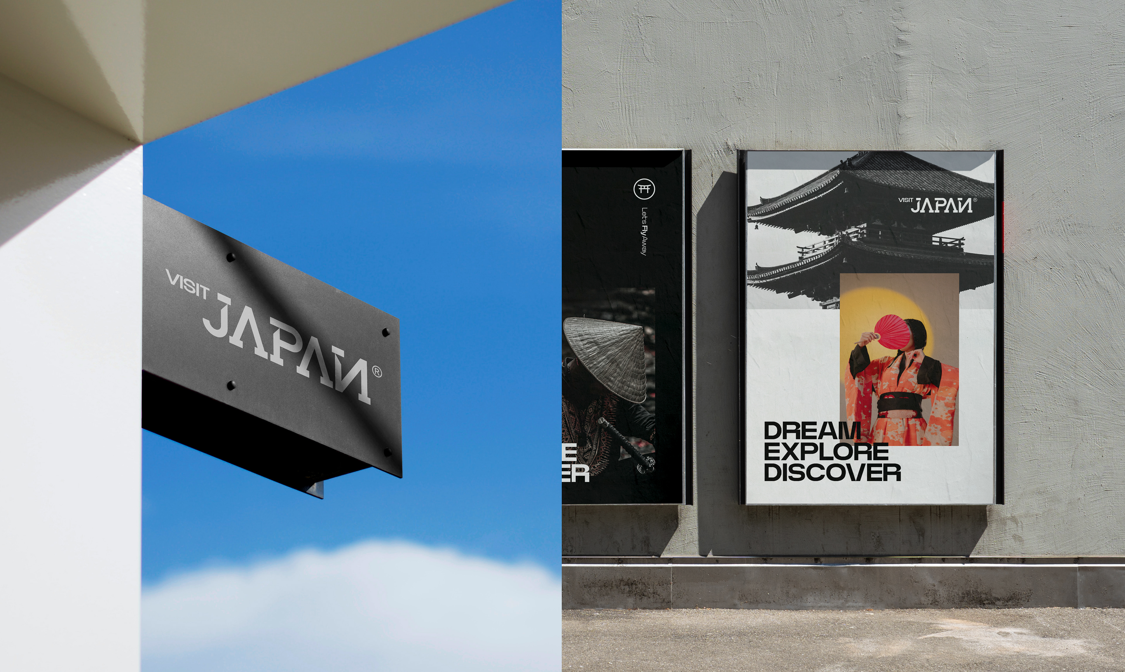
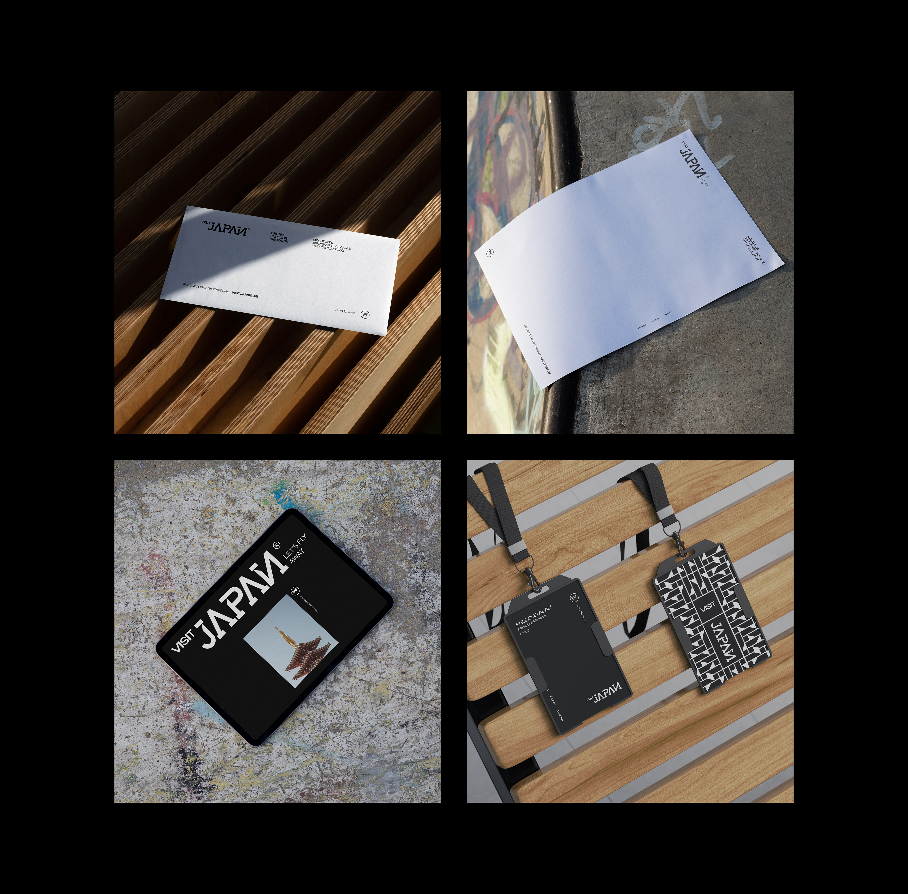
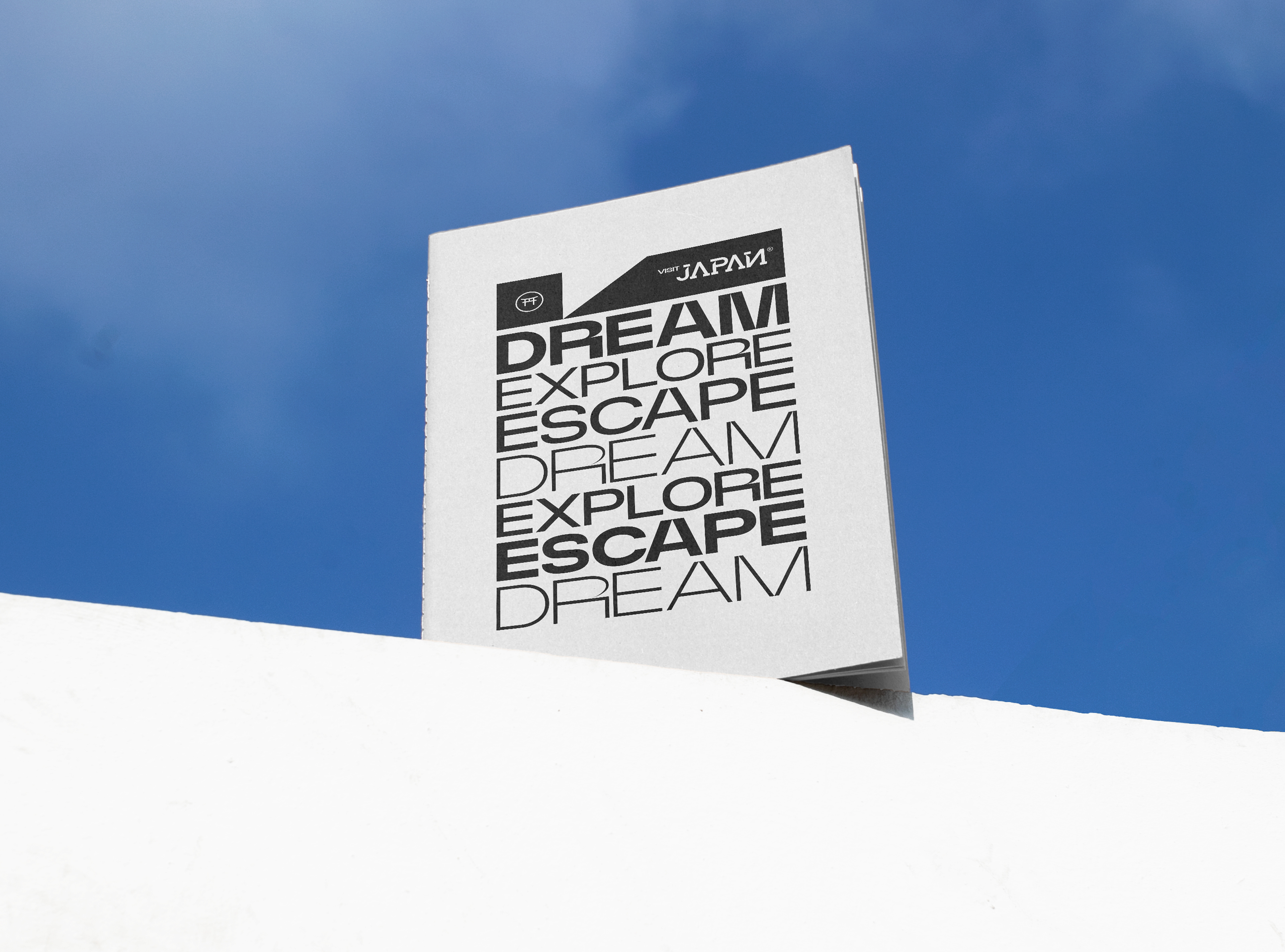
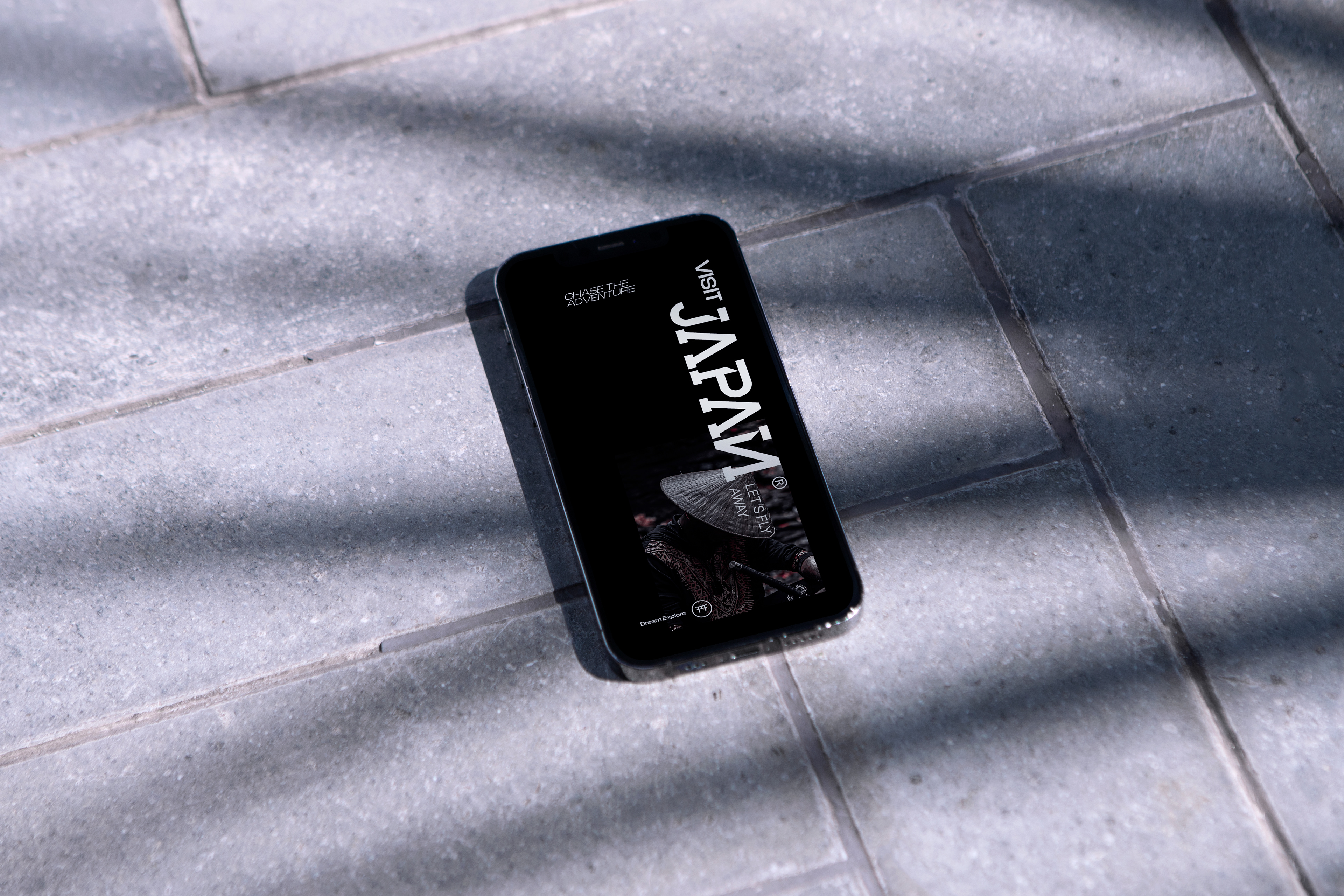
I designed a custom logotype inspired by traditional Japanese typography — angular, symmetrical, and bold. From this logotype, I extracted a modular pattern system that became central to the identity. The sharp, architectural forms in the pattern reflect the discipline, strength, and precision found in Japanese culture. These patterns weren’t just decorative — they became a visual metaphor for the structure and intensity that define Japan’s identity.
I designed a custom logotype inspired by traditional Japanese typography — angular, symmetrical, and bold. From this logotype, I extracted a modular pattern system that became central to the identity. The sharp, architectural forms in the pattern reflect the discipline, strength, and precision found in Japanese culture. These patterns weren’t just decorative — they became a visual metaphor for the structure and intensity that define Japan’s identity.
Visual Language
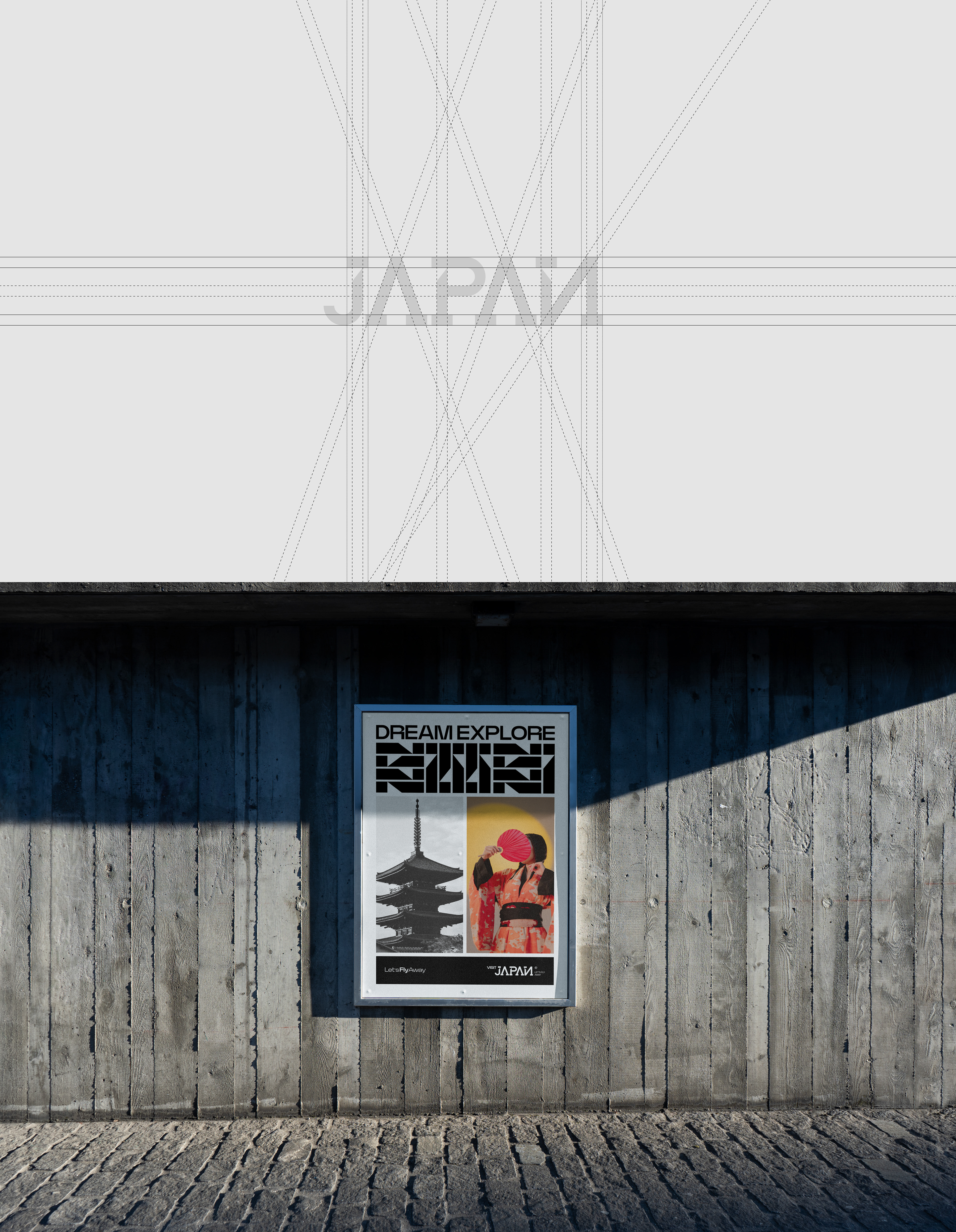
Rather than relying on the country’s stereotypical vibrancy, I chose a black-and-white palette to highlight contrast and clarity. This decision gave the identity a timeless sophistication, letting the visuals speak with bold restraint and poetic impact. The monochrome palette also allowed the custom typography and patterns to take center stage.
Rather than relying on the country’s stereotypical vibrancy, I chose a black-and-white palette to highlight contrast and clarity. This decision gave the identity a timeless sophistication, letting the visuals speak with bold restraint and poetic impact. The monochrome palette also allowed the custom typography and patterns to take center stage.
Outcome
The result is a brand that confidently invites exploration — dreamlike yet structured, modern yet deeply rooted in tradition. Every visual element, from the typography to the modular posters, reflects a deep respect for Japan’s past and an excitement for its future.
The result is a brand that confidently invites exploration — dreamlike yet structured, modern yet deeply rooted in tradition. Every visual element, from the typography to the modular posters, reflects a deep respect for Japan’s past and an excitement for its future.