Overview & The Challenge
Everkin is the premier luxury e-commerce platform for personal care in the KSA. Our goal was to move beyond traditional beauty branding to create a bold, authentic, and globally competitive visual identity. The challenge was fusing the concept of natural authenticity with pure high-end luxury across all touchpoints.
Design Execution:
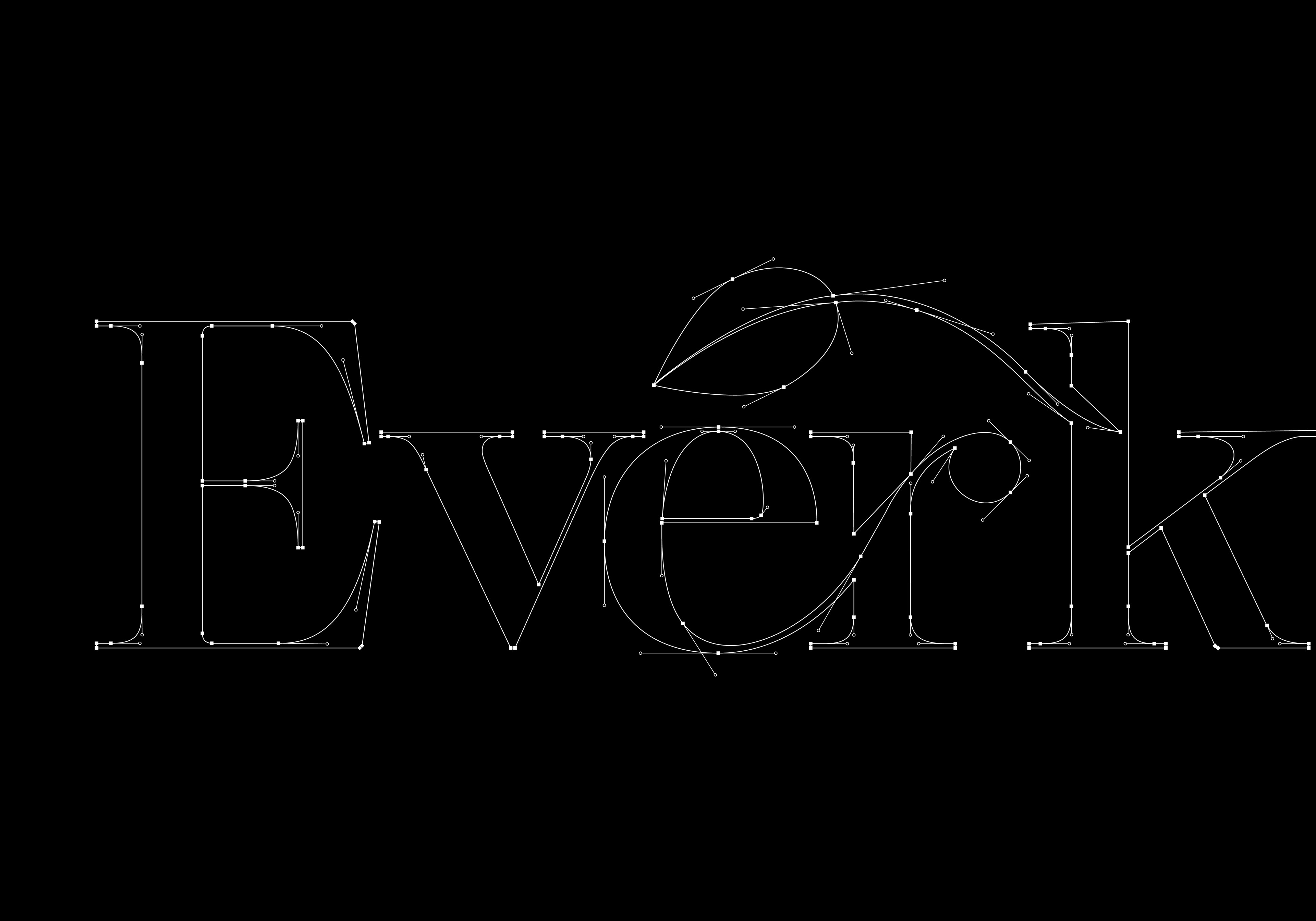
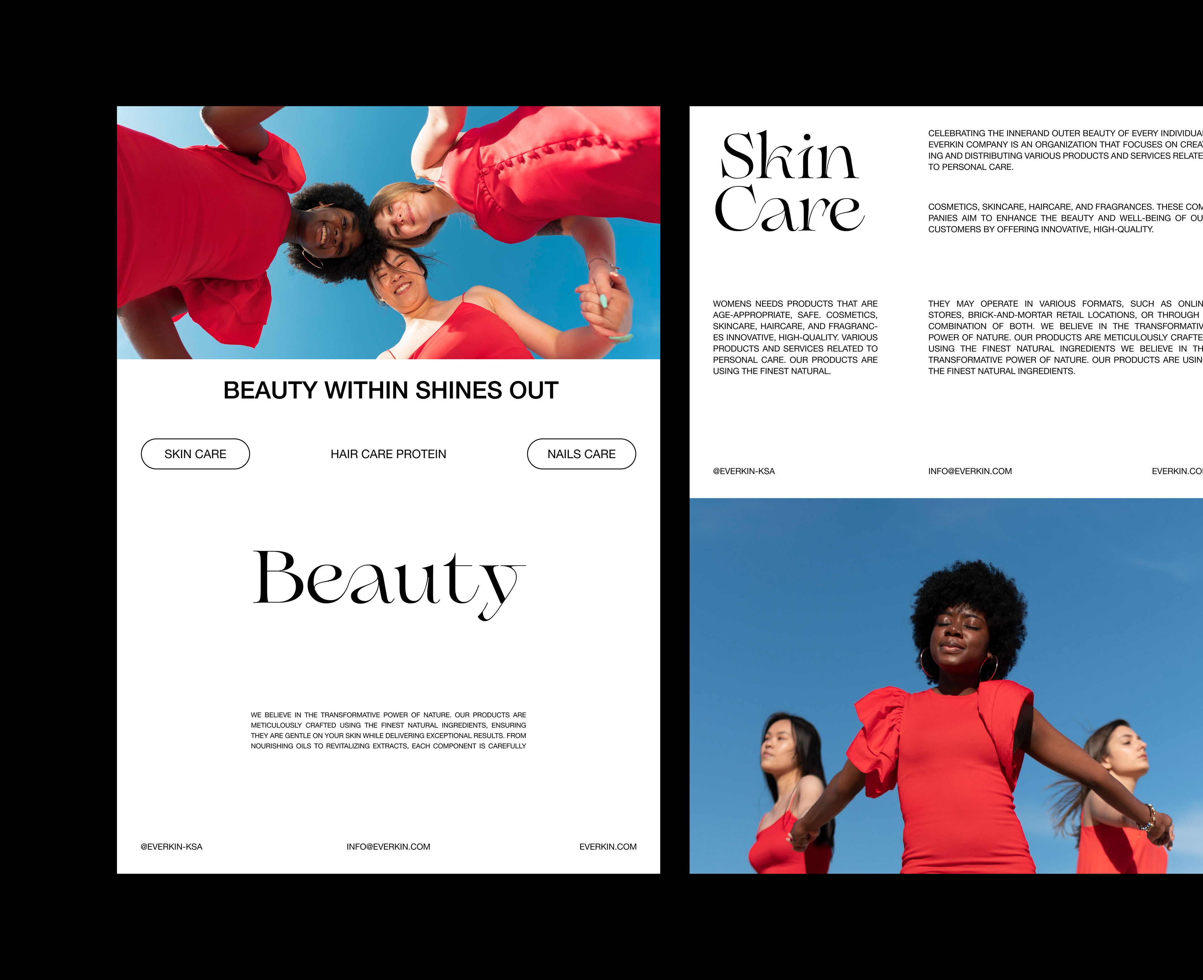
1. Signature Typography: Nature Integrated
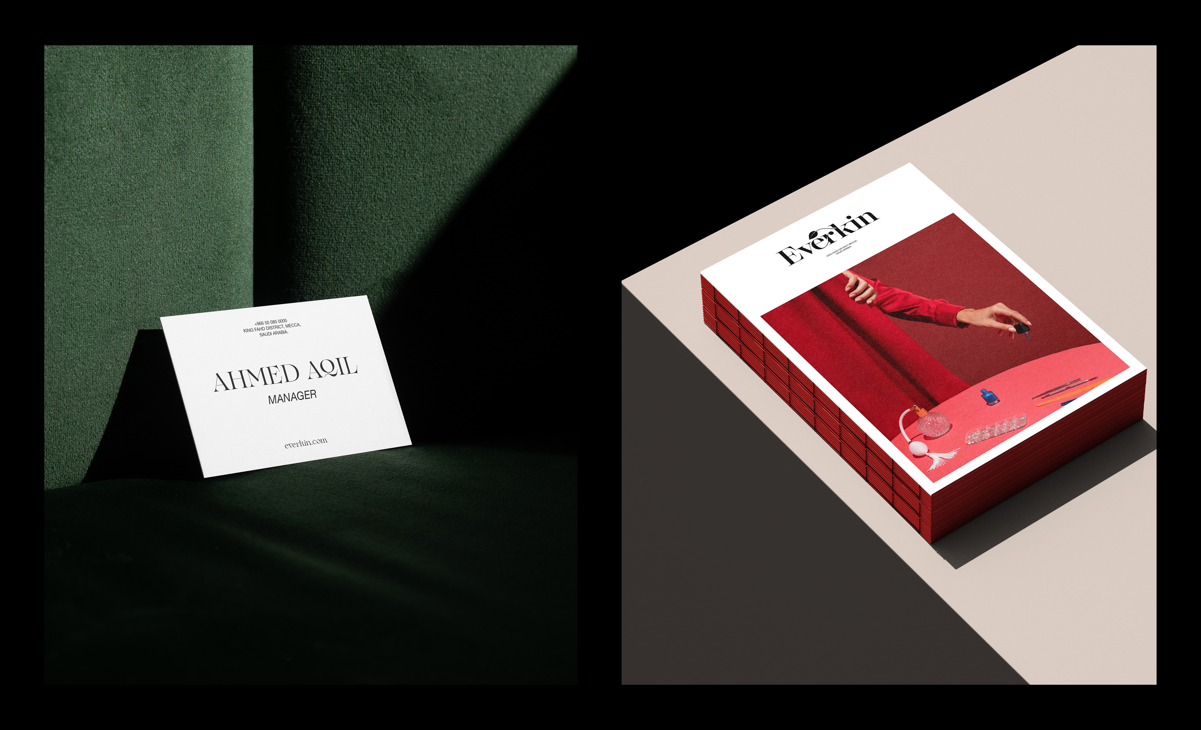
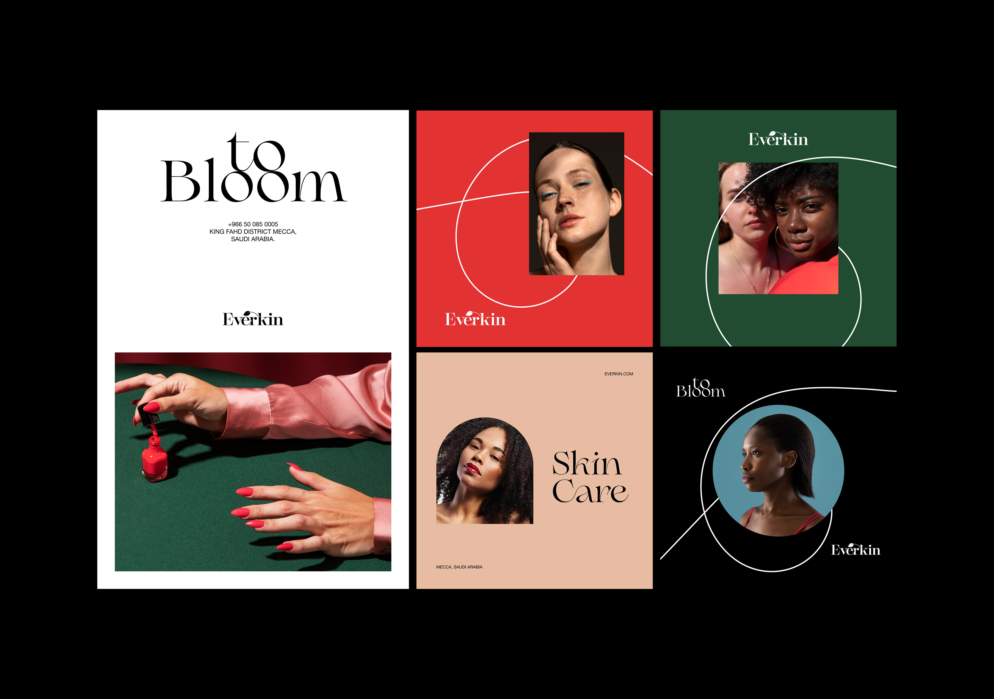
The project’s highlight is the custom serif logotype. I engineered an elegant, subtle leaf motif precisely into the letter 'k'. This single, sophisticated detail links the brand to nature and timeless beauty, acting as a powerful strategic differentiator.
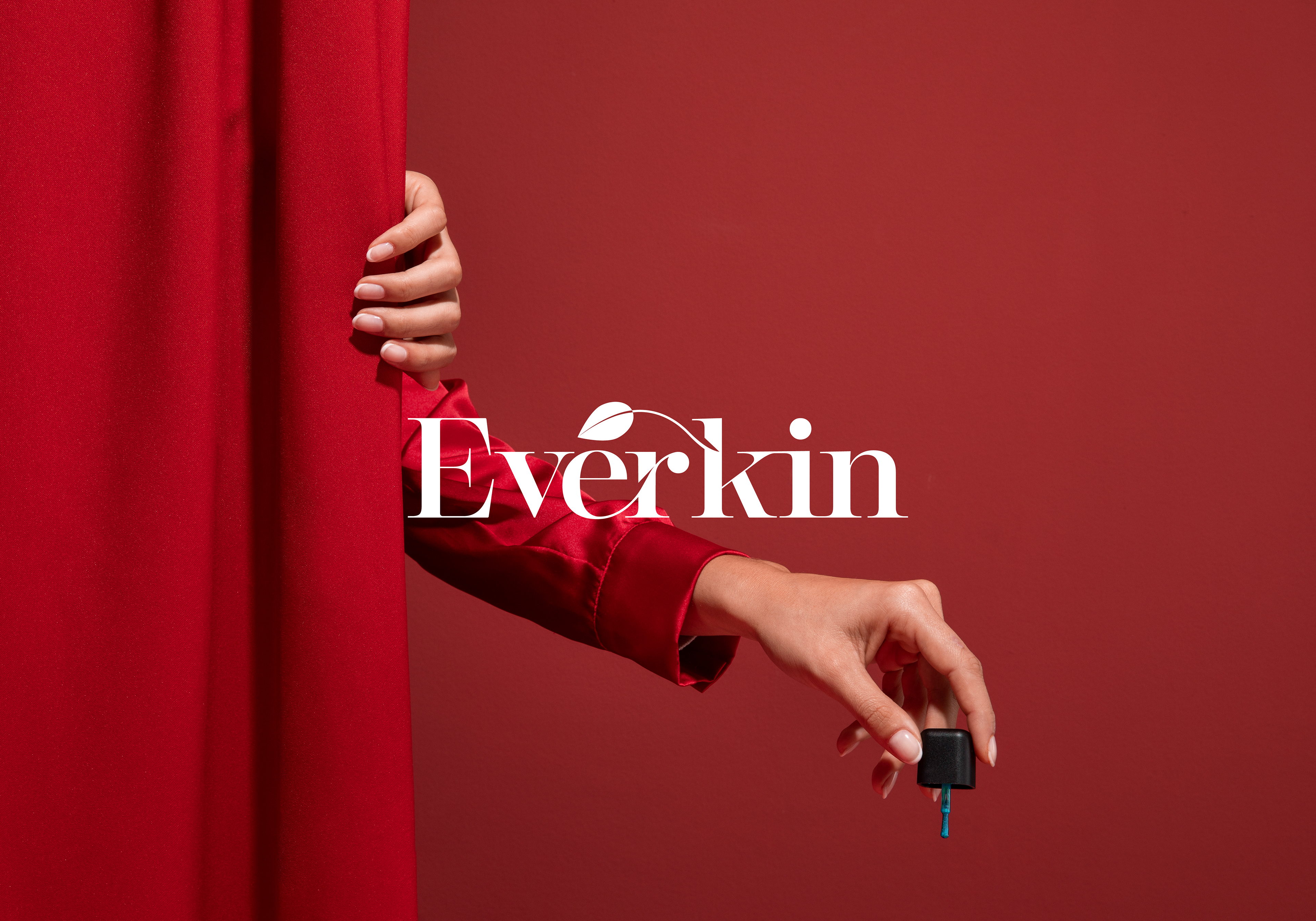
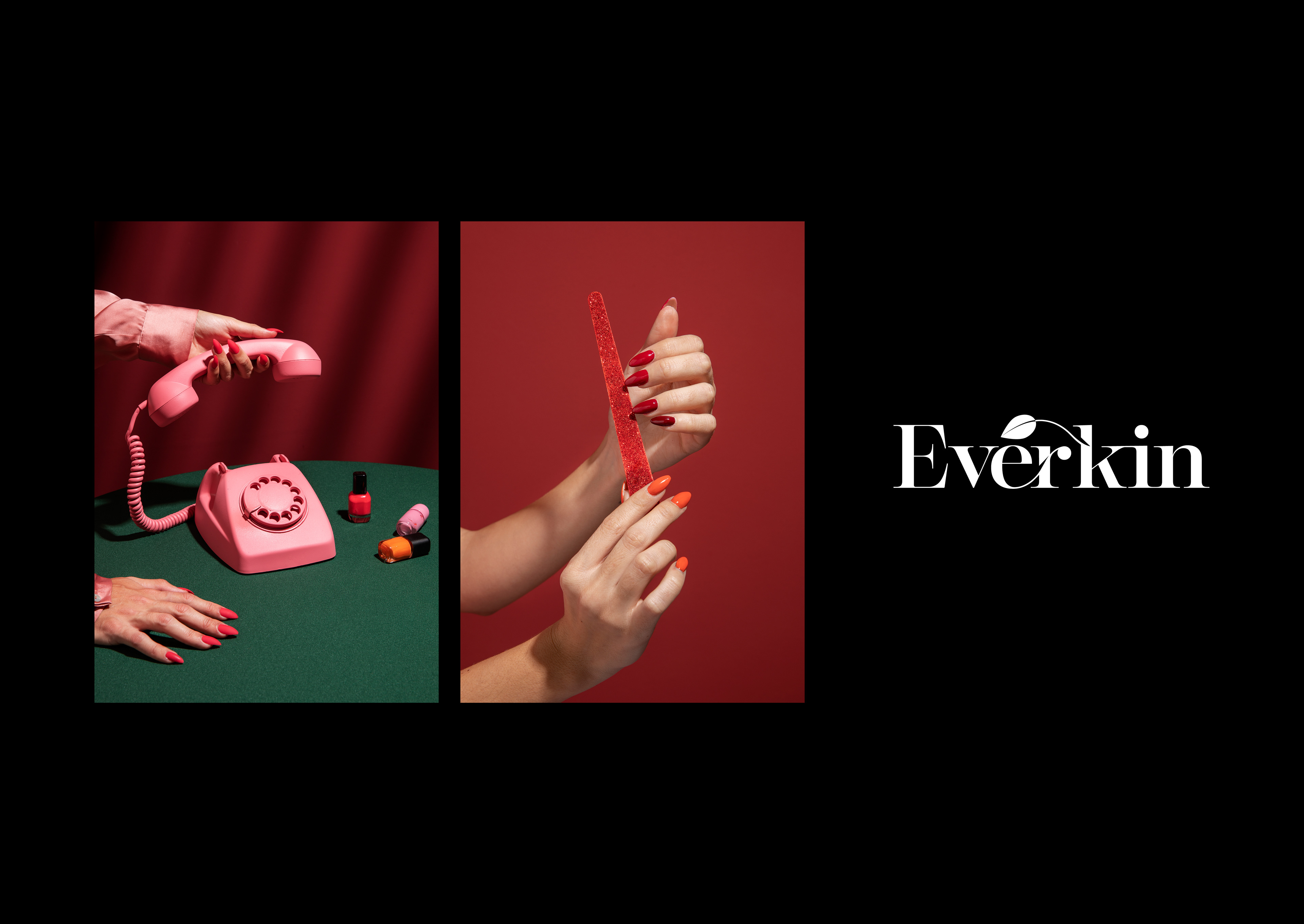
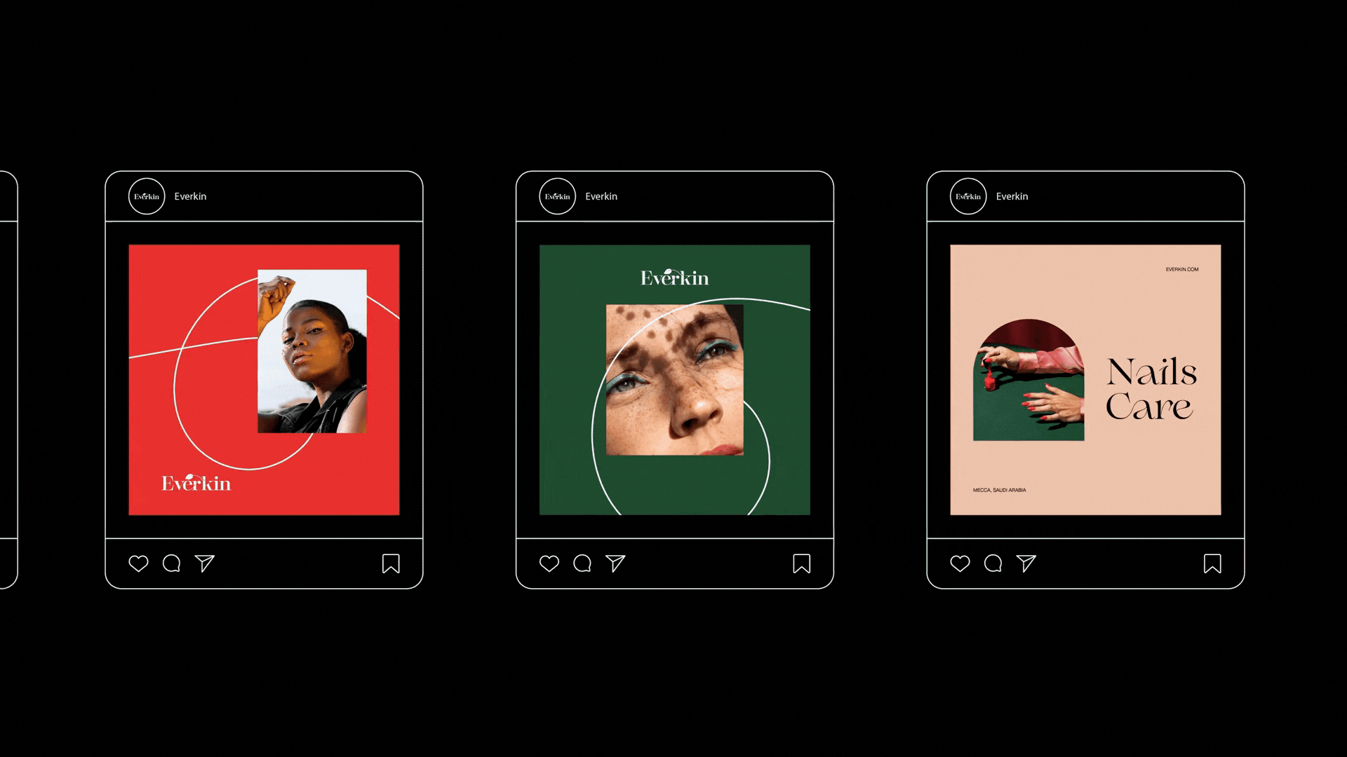
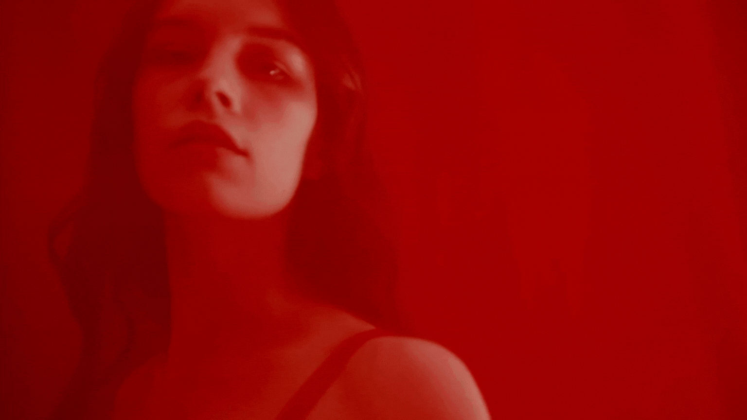
2. Visual Tone & Color Palette
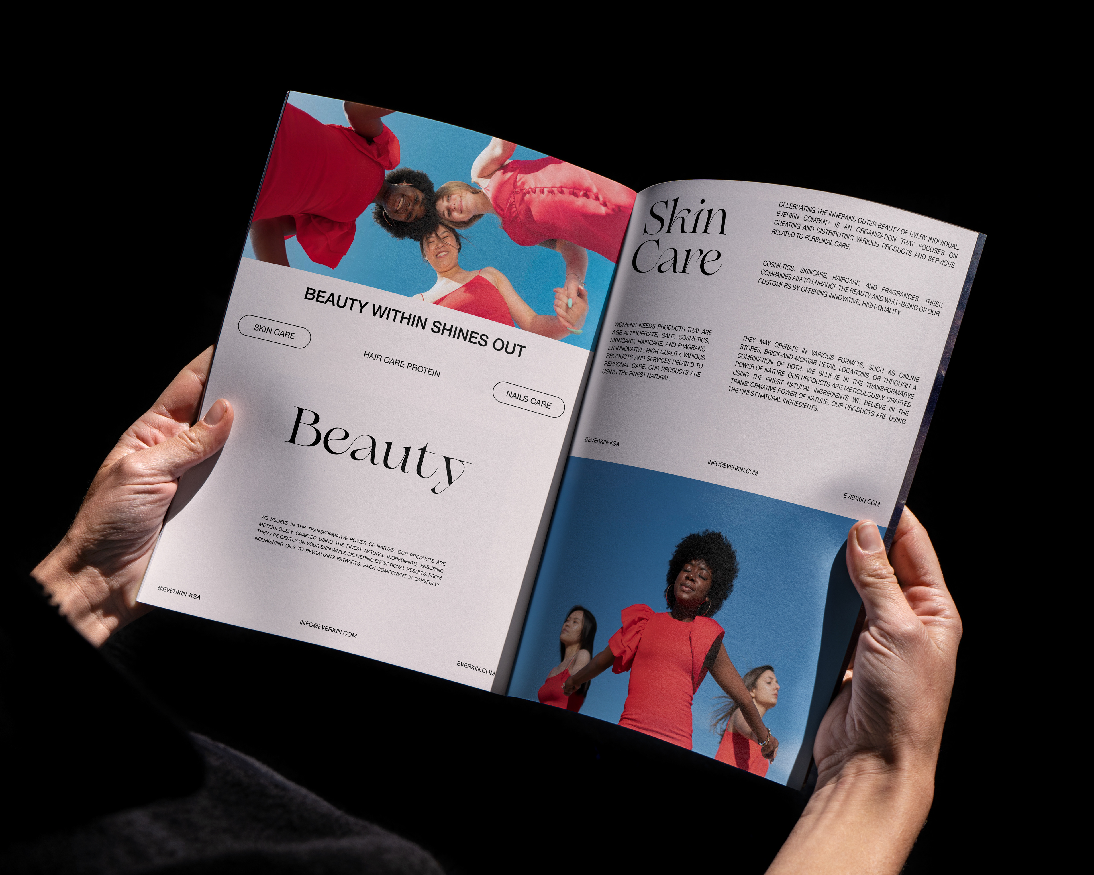
The visual language is cinematic and dramatic, built on high contrast. The palette features Deep Crimson Red (passion) and Velvet Green (care), set against elegant black and clean white bases. This deliberate tension creates visual luxury and emotional depth.
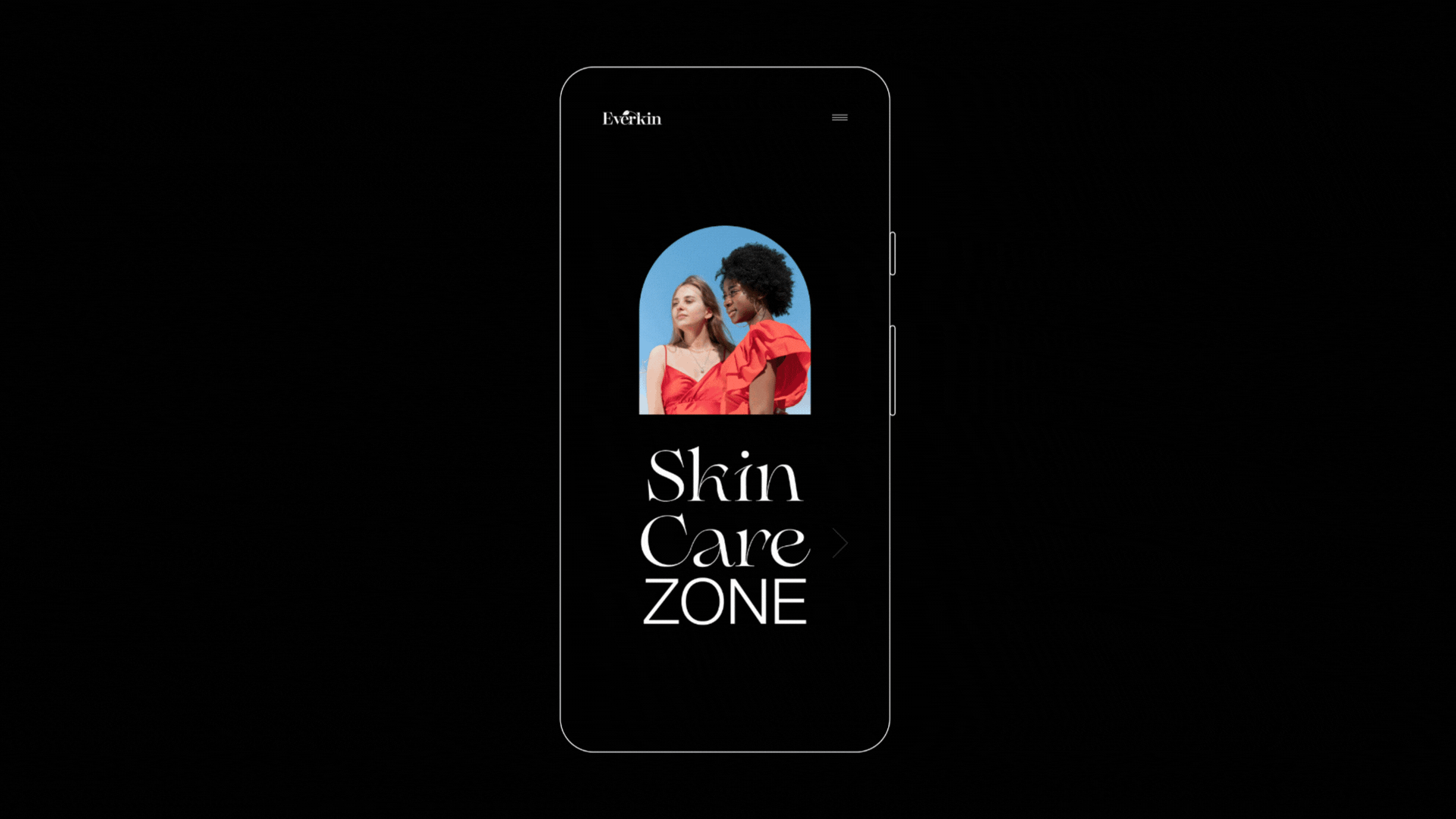
Holistic Application
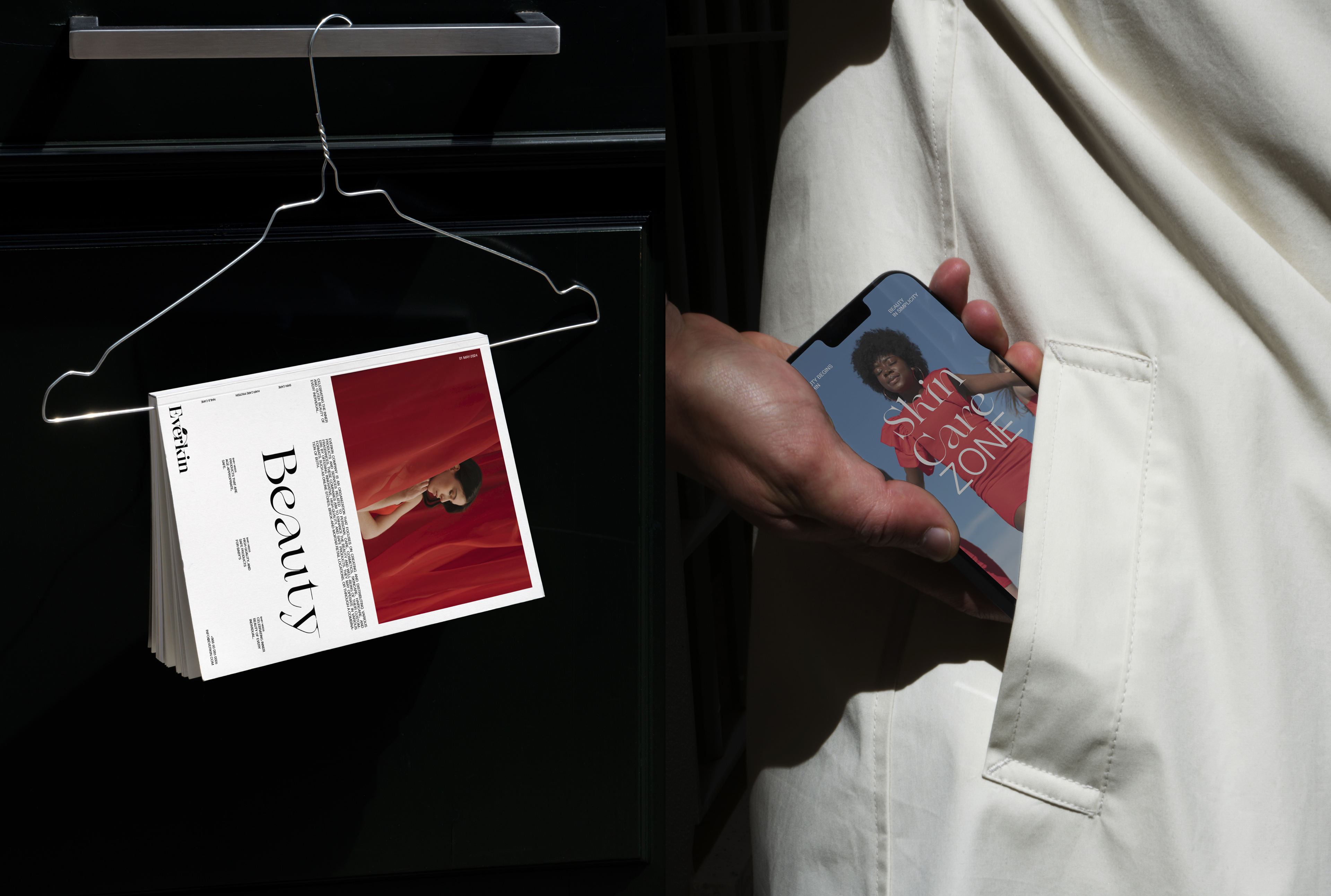
The identity is fully realized across platforms. The mobile UI/UX is sophisticated, utilizing a dark-mode foundation to enhance product luxury and clearly segmenting services into intuitive 'Zones' (Skin Care, Hair Care). This seamless experience from print to pixel confirms the brand's strategic integrity.
Conclusion: A Benchmark in Digital Luxury
Everkin is a demonstration of strategic luxury branding. By emphasizing subtle detail (like the leaf motif in the typography), high-contrast aesthetics, and holistic application across both print and digital platforms, the project successfully establishes a powerful and authentic brand identity. This level of comprehensive strategic design and execution sets a new standard for luxury e-commerce in the region.
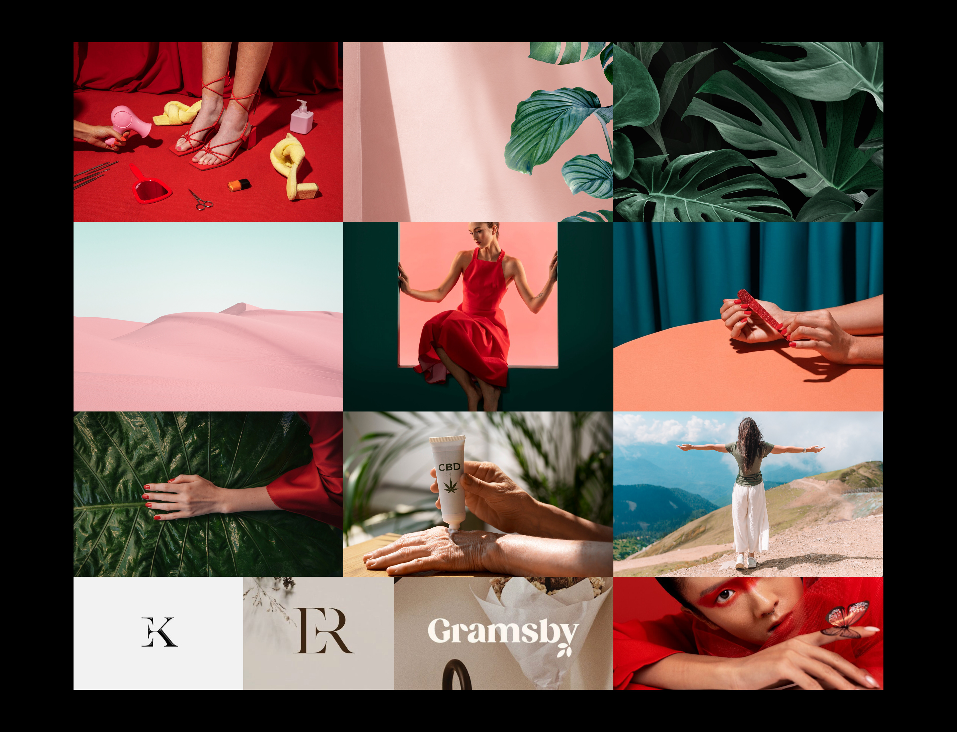
Moodboard